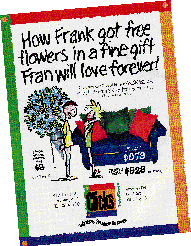
Retailer Click's uses a creative approach to attract adults age 25-39.

There's a retail revolution going on in the heart of old Victoria, British Columbia. In a fascinating walking district on the edge of China Town, there's an ancient ships' chandlers, now a general store, and Chintz and Company, a high end decorating shop. Across from Chintz sits a turn-of-the-last-century truck garage, now revitalized with great gobs of imagination and much elbow grease, into a highly innovative home furnishings store called Click's. The 10,000 square foot space began life four years ago as a clearance store, and sales just never really took off. Terry Potter, "The father of Click's" according to President Derek Denny and his coconspirator Anthony Gray, "Came up with the new concept, then we all got involved. Our slogan is 'Where Frugal Is Fun!"'
Standard Furn- iture, also under their umbrella, has been a respected, well run and successful retail establishment for many years, but the Click's approach to the consumer, although a tad zany, makes superb business sense.
Anthony told us "The floor was totally filled with grease. We scrubbed, then re-cemented the floor, carpeted it and did some finishing work inside, a very old feel but with a flavor all its own. We used primary colors, brilliant red, yellow, green and blue, just like our logo. Then we painted the outside a really noticeable mustard yellow, and mounted awnings, colorful signs and flags." Even parking meters and lamp posts felt the touch of a bright red brush! Their marketing approach is equally dazzling.
The corporate Positioning Statement, "Click's is the Vancouver Island furniture retailer that offers the best selection of contemporary, unusual and stylish furniture and accessories at low to moderate prices. The store's ever-changing range of in-stock merchandise which encompasses ready-to-use, unfinished and unassembled 'you-build' items, encourages customers to visit frequently. Value-conscious young West Coast families, predominantly adults 25-39, can count on Click's staff to be courteous, helpful, friendly and reflective of the store's fun, low- pressure environment."
How to get this across to the public? "'Where Frugal is Fun' not only placed our price point," said Anthony, "it also gave us the opportunity to be alliterative in our ads. A neat whimsical approach was developed, with great visuals, using our signature vibrant colors. Copeland Communica-tions is responsible for the creative side, our logo, and advertising. We developed fun characters, Fran and Frank, and one of the first ads was headlined 'Fran's Fun Furniture Fable' which set the tone for the ongoing series. We maintain continuity; our ads appear every week on the back of the TV Times. Each ad is unique, fashionable, amusing, using different furniture. And we don't keep the focus on price all the time."
Usually salubrious, Victoria was visited by a devastating winter storm during the last holiday season. Heavy snow brought down the roof of Standard Furniture's warehouse and half their inventory was lost. Talk about lemonade from lemons, a new ad, "Fran and Frank's Freak Flood Sale", appeared in the Times-Colonist within days. Other themes have been "Fran and Frank's Festive Philosophy", "How Fran & Frank Created a Fine Place to Fall Asleep", "How Frank Got Free Flowers in a Fine Gift Fran Will Love Forever" and "Funky Frames, Folding Chairs, Fine Couches. (And everything frugal folk long for!)"

Anthony says, "Mouths drop when customers walk in! The first things they see are walls painted funky colors, and Amisco's metal furniture, all in bright colors. We have Beatles music and nostalgic videos playing throughout the store. The staff wear denim shirts with Click's logo on the front and our slogan on the back. Rose Wagner does all our display which includes dynamite cardboard cutouts of Fran and Frank in a variety of poses around the store, and black and white prints of movie stars.
"Customers come in and browse. They see room settings complete with lamps and carpets, everything from home theatre to home office, decorated really uniquely. People are mesmerized by so much selection. We're featuring C-Style's retro contemporary upholstery, right in sync with the mood of what we're doing. Then there are leading edge accessories and accent pieces, butterfly chairs, big 220" bean bags in brilliant colors, chrome tables just like Happy Days from Acme Chrome, Umbra picture frames, bathroom pieces in trendy depression glass, door mats, down comforters, a wide range of throws, funky lamps, fabrics, draperies, shower curtains, a whole different side of the business. In our bistro section, there's a good diversity of dinnerware, chef's aprons and flatware. Customers don't just stop in for five minutes, they come in and spend an hour.
"Our target population is 24 to 39, although we see plenty of grandparents, too. We encourage people to bring their kids, and we're talking now about installing a cookie maker or a popcorn machine.
"We're taking a frugal margin on all our products, an every day frugal price that's good value. Down the road, Derek would like to franchise. Today, more than ever, if you have a regular furniture business, customers tend to avoid the shopping experience when the economy blips, they're not as interested in coming in for the big purchase. But if they know there are frugal purchases to be had, like our 99 cent candles for instance, they'll still come in and rarely leave without buying something.
"Every week our sales are a little bit bigger and better. On any weekend there can be 40 to 60 people at the store at any given time. We have nice steady growth, and our inventory is coming back nicely. Now we're beginning to fine tune. Derek encourages us to go for it, if you make a mistake it's not the end of the world. We're all being very creative and positive. We've taken off the shackles of thinking we normally have. I can see it, I can feel it. And staff morale is the same."