In the 17-vignette presentation, the modules appeared to float, 10’ x 10’ with one-foot breathing room between them, two rows of eight tiny “rooms”, each with its own raison d'être. “Very easy to construct and very flexible, think about them as a central display or scattered through your showroom.
“Colour is so important to create mood and to make environments appear attractive and functional in a store setting,” said Pierre. “You’re fabricating representations of happy places to live, interact with families, even to sleep. Black is once again important,” he said, “and browns, they are foundations to some designs, accents in others. Greens, turquoise, pinks are ‘in’ and, new on the rainbow scale, try vibrant purples.
Psychologically, purple shouts ‘buy’ to the undecided customer.”
A bright children’s room (1) had all the elements to delight a junior mariner.

Imaginative linens kicked off the use of huge white sails applied to the blue wall, ready to carry kiddie’s to the land of nod. The dresser is topped with a sail-less ship’s model, the upholstered headboard soft and comfortable. Both from South Shore. Colour tones, a new combination of blues, brown and cream. “Find accessories that knock your socks off, but are not expensive. Accessories are the salt and pepper of a display.”
From boats to birds in the next vignette (2), three real birdhouses and, on the wall, facsimile tree branches as perching space, whimsy for the spring living room. The Coja loveseats are modern classics, strong, clean lines in leather and retro wide cream corduroy. Coffee table by LC Meubles, and the lamp is an effective stark contrast.
Bermex’s dining room setting (3) comes to life with paper cone shapes from Ikea (a lower cost Scandinavian outlet. Similar pieces are easy and inexpensive to find in most craft stores.) The cones are applied in graphic form to the red wall. Yellow, green and red illuminate the wackiness of upside-down painted vases on the table and sideboard.

Leonardo da Vinci, of Code fame, still very hot with the movie about to appear, dominates the Villageois bedroom (4) in a silk banner, hanging free of the blue wall. Colours are green and matching blues with a tasty chocolate brown, the headboard crafted in leather. Sculptured legs define the grouping.
Canadian designer, Karim Raschid, now operating from New York City, created a landmark chess set that inspired this unique living room (5). Wall graphics devised from finely cut mirror reflect anyone passing by. It’s constantly moving, changing, a point of interest. Romano’s sectional is pale gray blue, complemented by the white leather ottoman. If not chess, try scrabble!
A Charles Gobbout design, Laurier’s dressers with aluminum legs are well proportioned (6). William’s red and white chair cushions match the dresser. The three-dimensional wall-mounted tree, another plastic creation by ALGUES, is in fascinating motion. Wall effects were conceived by the Bourouillec Brothers. Pierre saw them first in Milan and bought them in New York. But they are also available in big design stores across North America. Keep your eyes open.

The huge white cup in the welcoming breakfast setting (7) was a Montreal find, the espresso wall cutouts are silver, white and red vinyl. Trica’s chairs, very light to move around, are in “wake up” red! In happy contrast, the wall is Tiger Lily orange. “Don’t overlook unusual colour combinations. They catch the eye; they are a stimulant.”
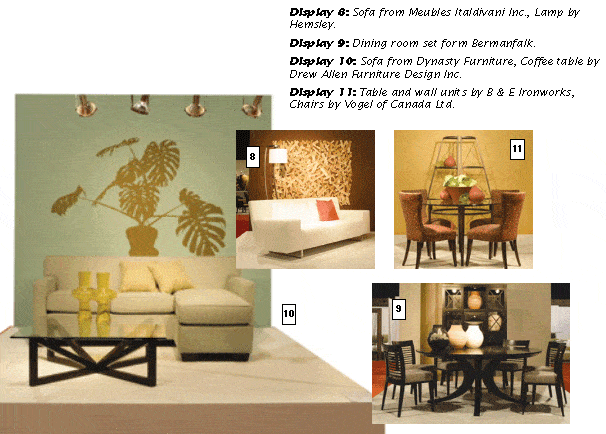
Pierre loves to use natural textures whenever possible and cut pieces of cedar “more or less the same size”, then nailed them to the wall “like a piece of art” on an Etruscan Pottery paint base (8). “Makes people ask questions and want to do it themselves." Smooth leather and the rough wall are a satisfying contrast in texture. Meubles Italdivani’s sofa is accented with orange cushions. Support legs are fashionable chrome.
If your customers’ inclinations tend more towards traditional, Bermanfalk (9) has fashioned a dining room in classic lines, but “still modern”. The four-legged curved pedestal table is an outstanding statement, the chairs contrasting horizontal slats an interesting architectural feature. Colour treatment, a striped mix of two shades of cream and mocha. Pierre offered another tip, “Keep your customers around longer with designer coffee. Offer them espresso or a variety of blends. They’ll sip and enjoy and hang around longer to look, talk and buy. A small investment on your part and I promise it will pay dividends!”
A huge vinyl cutout of an exotic, intensely green jungle plant (10) applied to the blue/green wall puts viewers in a positive mood, and “It’s so easy to do, so attractive to look at.” The Dynasty sofa is soft blue fabric, toss cushion blue/green. The glass-topped Drew Allen coffee table has solid grounding with its wooden base. Two yellow vases provide a splash of that important punchy colour.
Two gunmetal gray etageres, designed by B & E Ironworks as corner units, are placed together against the wall, a different way to create shadow play and superimpose another architectural form (11). Vogel chairs are in red, brown, yellow and green and the onion pots (from your local garden centre) were painted terracotta. “The salad is pretty,” said Pierre, “but don’t eat it. It’s made of rubber! You could use fruit here, but keep it green, Granny Smith apples, limes, unripe pears. Or again rubber!”
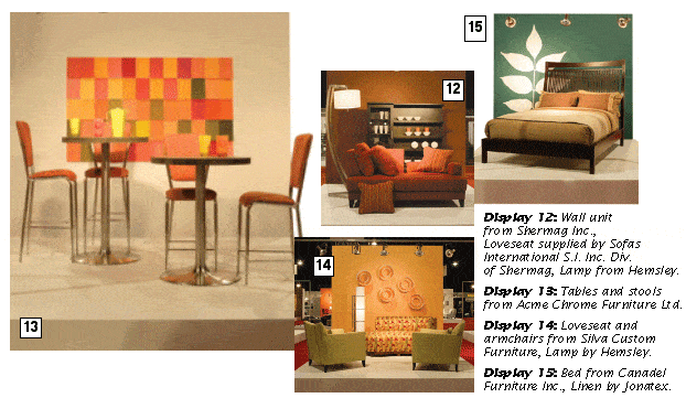
The “Chameleon” collection, by Shermag’s Sofas International, is well known for its flexible seating units (12). Take arms and put them on the back of the sofa, or vice versa, upside down and back to front.
Pierre had found a “softie” clown doll, 4 feet tall, intending to stand it on its head against the sofa. But a favourite nephew claimed it just before the Market. “Get a colourful ‘softie’ for your display, then offer it as a door prize!” Here “Chameleon” is in 2006 orangey-red with matching accessories. The Castafiore wall colour is a rusty brown. The wall unit, in a larger size, can accommodate television or a music system.
Our design guys fashioned paint samples into yet another piece of modern art. A multitude of colours fastened with double stick tape “only at the top” provides eye-candy and arresting constant movement.
Acme Chrome’s tables in satin chrome are topped with exceedingly durable gray cement in pub height and standard, the chairs in sunny orangey-peach (13).
Flight of fancy wall interest here is entirely lampshades, stacked one within another, white on an orange Exotica wall. The chairs are green, the curved Silva chaise red, green and yellow (14). The outstanding lamp sculpture is a white elongated tube, banded in chrome. “You could also use this shape to flank an entrance to a display, one lamp on either side.”
Mission style by Canadel (15) with its architectural simplicity is still very much in vogue as is pleasing bedding in mocha and cream. (Coffee, again!) The wall is in Maritime blue accented with huge white vinyl leaf fronds, another ALGUES product.
Décor-Rest’s Alexander Julian chaise (16) was a crowd pleaser at the Market, draped in warm brown and leafy green fabric, “a very nice print”. On the wall, the wizards marched silver-black ceramic leaf shapes, “actually they are man-made rocks one uses in the garden,” said Pierre with a grin. “Got them from a nursery at winter half-price in early January.”
They created a village square (17) to make a gathering place for visitors in the center of the vignettes, many accommodating European-styled units in a variety of shapes, “much used” during the Market, a Perez set piece. Need a seating area in your store?
Pierre’s final words of wisdom for 2006, “Keep everything simple. Have fun with your displays of furniture and accessories and most especially with colour. Let your imagination run riot. Buy interesting accessory pieces wherever you see them. Be brave, let go, paint things, use appliqués. Express yourself, make changes as often as your spirit moves you. Rediscover your own magic. And encourage your customers to do the same.
“Why not celebrate new trends, invite your preferred customers to a lively springtime event, sparkling white wine and early strawberries? Could be magical!”
For your guidance, throughout the Trends Display vignettes, all linens were from Jonatex, lamps from Hemsley and wall colours from Paint Café, Societe Laurentide.