Part 4: How to promote your retail brand from the outside
Strategic Branding by Martin Roberts
In the October/November issue of FURNITURE WORLD Magazine, we talked about uncovering your retail store’s identity, or DNA – that is, what makes it unique. Part 2, published in the December/January issue, discussed the issues of brand positioning, branding research, brand voice and brand promise, while Part 3 delved into how signage, graphics and environmental elements work together to optimize communication of your retail DNA. This month, we’ll take a closer look at how to support your brand building efforts with the biggest, most permanent billboard available – your store exterior.
Consumers are driving by your store every day on their way to work, to run errands, or to drop the kids off at school. It’s great to be part of the landscape – unless you’ve become part of the background.
As Malcolm Gladwell suggests in his best-selling book “Blink”, your target customer is making a snap judgment about your business with one glance. Fortunately, you have a built-in billboard at your disposal – your store’s exterior – to instantly (and constantly) reflect your brand’s unique DNA and attract your ideal shopper.
So, what does your storefront say about your brand? Do you appeal to the young and hip or to those who may be shopping for hip replacements? Does it reflect that you are an expert in contemporary or traditional furnishings? Is it evident to her, when she drives by, that you provide design solutions or warehouse pricing? Or, does your storefront say only that you’re still stuck in the 80s?
If you haven’t upgraded your exterior in 15 or 20 years, it’s definitely time for a facelift. Assuming your brand identity, logo and signage are up-to-date (if they are not, start there), begin your exterior analysis with architectural styles and materials used. What fits your store and its particular retail DNA? It might be Colonial elements and red brick or clean curves of steel and glass. You could choose to convey a sense of history and permanence by erecting a stone facade. It’s possible to infer from the tailored landscaping that you value good design. Whatever the cues, the process is similar to deciding what kind of furniture to feature in your store: that is, what’s right for relating to your target customer?

Most important, don’t forget that your store exterior is one of your best branding and communication opportunities. It’s your best vehicle for non-stop advertising. If you still need to be convinced of its value, compare what you spend on ephemeral advertising - the TV, radio and print campaigns – to design and construction costs associated with the exterior renovation averaged over a conservative 10 years. Can you afford not to let your storefront work for you?
Grow Your Billboard
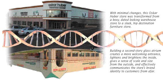
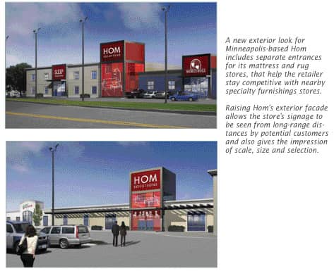
Raising any exterior facade to two stories — even if your store occupies only one floor —will allow your branding efforts to be seen from long-range distances by potential customers, while improving the impression of scale, size and selection from the street.
Borders employed this design technique to compete with Barnes & Noble’s two-story stores. Though the effect on passersby is similar, second floors tend to produce less revenue than ground floors. Borders also spends significantly less per store than its competitor – due to reduced construction costs, the absence of stairs, elevators or escalators, lower inventory commitments and fewer store staff members.
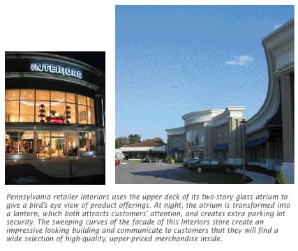
Pennsylvania furniture retailer Interiors’ two-story glass atrium is another good example. The upper deck enclosed by larger window panels has become a critical means for showcasing product. Though Interiors has always featured high-quality and upper priced merchandise, this was hardly evident to customers passing by the company’s original warehouse-style building. Now the store can attract potential customers with a bird’s eye view of their product offering.
Rabbit Run
Most furniture retailers have one main entrance that opens to a centralized reception area. This supports UP systems so that sales staff can be called up to the front of the store. But studies have shown that most consumers don’t like this setup —today’s consumers are too time-starved. They want easier and more immediate access to the products they desire. Providing that access with multiple entrances – another relatively inexpensive construction expense – is the newest trend in retail exterior renovation.

Consider highlighting your high-growth and high-margin categories and then establish separate entrances for each – another exterior “trick.” Inside, all the departments may be united by a continuous walking path. One furniture retailer with separate entrances to the mattress store reports a 25 to 30% increase in bedding sales as a result of this type of exterior renovation. For another store, rug sales increased by 100 percent when a new entrance to this department was created.
A new exterior look for 80,000-square-foot, Minneapolis-based Hom includes separate entrances for their mattress and rug stores. One effect is that of making this large store more competitive with the specialty furnishings retailers in nearby strip centers. Today, you can’t underestimate shoppers’ desire to get in the door from less than 10 yards of where they’ve parked their car.
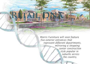
For Dayton, OH-based Morris Furniture, five exterior entrances will soon represent different departments in their new 100,000-square-foot store, including a main Morris Furniture entrance, Home Entertainment, Mattresses, Kids, and an Ashley store. This lifestyle center mirrors a shopping center construction style popular in suburbs across the country.
Additionally, sales improve when the customer can shop more efficiently, especially in the case of destination merchandise. For items like mattresses or youth furniture, the shopping occasions are short and dedicated, and consumers don’t want to waste time before they’ve found what they came looking for. Keep in mind that most impulse buying doesn’t take place on the way into a store, but on the way out. If it’s easy for customers to find what they’re looking for, they will feel at ease. You create better opportunities for add-on sales like pillows and other accessories when shoppers have time to spare.

Let There Be Light
Big box or no, a dark, warehouse-type look feels dated and dingy to most consumers. One way to lighten and brighten is to add that second story glass atrium, as previously mentioned. Mirrored panels may attract attention from the outside but are obviously ineffective from within. With a limited budget, consider instead skylights and fresh ceiling paint in light hues of white, gray and sky blue.
The bright, recessed lighting and wall sconces which transform Interiors into a giant lantern at night– an ideal “beckoning” device in the darker winter months – also create a sense of security by brightening the parking lot for evening shoppers.
Look Here
Movement garners attention — it’s a natural programmed human response — so anything that moves in a storefront is a good idea. Basic examples include fabric banners and a variety of light sources, each of which may vary with the seasons. Or get really creative and include features that not only create movement, but also surprise and delight.
Have you seen or heard of the waterfalls employed in Laura Ashley stores?
Schultz Furniture in Erie, Pa. features a carousel that can be seen from the store’s exterior. The carousel not only attracts attention through its movement and color, but it also transforms the store into a destination for more than just furniture shopping. The free carousel ride enhances Schultz Furniture’s brand positioning by creating a warm, fuzzy feeling for the consumer while at the same time exposing them to the store’s product offerings. Even if a family isn’t in the market for furniture at the time of their visit, chances are they will remember Schultz positively when they are.
In a recent news brief, Ethan Allen is noted for its cross-merchandising partnership with Circuit City. Replacing the dead, old-fashioned cardboard electronic media props are actual TVs. Why? To facilitate more connections with shoppers. Expect to see more electronic media used on the outside of stores soon.

Wow Them
With today’s consumers spending less time reading newspapers and more time flipping through television commercials with their TiVo remotes, getting your brand message in front of the public through conventional advertising is no small challenge. Yet the front of your store is the medium you own– and the message is yours to control.
While a fresh coat of paint and a tidy parking lot are expected to maintain a welcoming environment for customers, don’t underestimate the power of a dramatic new facade for attracting new business. Plus, you can make the most of any remodel to generate buzz – aren’t grand openings and grand re-openings two of the strongest retail events around?
An ideal time to consider exterior changes is when your lease is up for renewal and you are in a position to negotiate for upgrades. Remember, your storefront should effectively communicate your store’s brand DNA to potential customers who drive by it.
Your store facade is your face to the public. Are you putting your best face forward?
Martin Roberts is an internationally acclaimed design industry veteran, with over 40 years of credits for retail and product design. His most respected work is included in the permanent collection of the Museum of Modern Art in New York.
Throughout his career, Roberts’ has placed special emphasis on the role of branding and marketing in his work. In 1991, Roberts’ launched GRID2 International, a specialized design firm that incorporates scientific methodology to inform the design process. Roberts’ previous works included such nationally and internationally renowned corporations and brands as Bank of Boston, Barnes & Noble, Cartier, Chase Manhattan Bank, Coach, Duty-Free Shops, General Foods, Johnson & Johnson, K-Mart, Marriott International, Nestle, Perrier, Samsonite, Thomasville Furniture, Timberland, and Wal-Mart.
Before founding GRID2, Roberts’ professional affiliations included membership in The Royal Society of Arts (London), the Society of Industrial Designers, and the Institute of Store Planners. With a BA in Industrial Design Engineering and an MA in Design Systems, Roberts has also served as an adjunct professor of Design Management at Parsons School of Design.
Questions on any aspect of retail branding or store design may be directed to him at mroberts@furninfo.com.