Retailers have
increased the scale of outlet areas and built freestanding outlet stores
to meet demand and provide merchandising flexibility.
The growth of outlet merchandise as a sales category has led some
retailers to create more store-within-a-store experiences and build
independent, standalone stores.
Clearance Centers
Furniture retailers have always incorporated discount, closeout or
clearance areas in their stores to offer shoppers damaged or returned
goods at steeply discounted prices.
The category attracts bargain-hunters who may visit these areas on a
regular basis just to see if any new deals are worthwhile. Many of these
shoppers find that the hunt for a good deal is much more exciting if the
transaction happens at a warehouse area located at the back of a store.
And, over time, the demand for clearance goods and an increased supply of
discontinued items encouraged retailers to create separate clearance
spaces adjacent to their main warehouses. These areas generally displayed
clearance items on an exposed concrete floor to keep that warehouse-feel
but have added unique branding, graphics and colors as differentiators.
Bold colors like red, orange, and yellow helped communicate the idea of
bargain or discount.
Bargain Annex, Bargain Barn & Other Examples
A number of retailers that merchandise their stores at good, better
and best price points are selling ‘good’ products in their outlet
spaces.
Many furniture retailers are devoting additional resources to create
larger and more effective outlet areas within their stores.
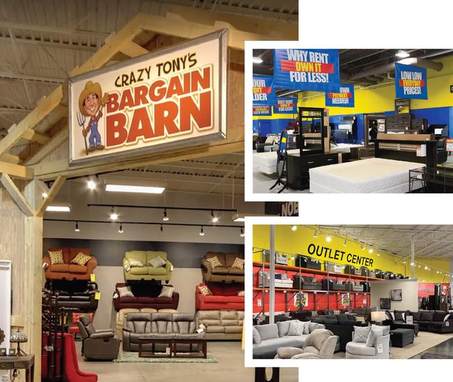
Tepperman’s: Tepperman’s, for example, built out a
branded area they call the “Bargain Annex.” The name implies that it is an
addition to the company’s main store. Branded yellow and blue, it screams
discount! Approximately 20 percent of the store is allocated to this area
separated from the rest of the store.
Boulevard Home: Boulevard Home developed a discount area
known as the “Bargain Barn” colored in bright red with rough wood and
other barn motifs. They also created a recognizable “Crazy Tony” farmer
cartoon character to help sell the concept. Like Tepperman’s, Boulevard
Home’s Bargain Barn has its own separate space occupying six to eight
percent of each of their stores.
Kloss Furniture: Kloss Furniture’s “Outlet Center” is
branded a signature yellow and red, ‘warning’ customers to not miss the
deals represented in this area. However, unlike the other retailers, they
don’t enclose the space. It’s kept open to the rest of the store, visible,
even from the front entrance of the store. This way the floor space it
occupies can expand and contract more easily, depending upon the amount of
outlet product available. As Kloss Furniture continues to open new stores,
the space allocated to their Outlet Centers grows larger.
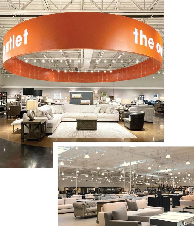
Furniture Mall of Texas: Furniture Mall of Texas
incorporates a new discount area across the back of their store. Named
“The Outlet.” It has oversized presence and visibility, in large part due
to the use of a signature orange color. This retailer has allocated over
7,000 square feet to this space that’s open to the rest of the store,
separated by just a low wall.

Tepperman’s simple yellow and blue color scheme with a concrete
floor (top right) sets its Bargain Annex apart from the rest of
the store. Crazy Tony’s Bargain Barn (top left) sends a clear
message to customers about the deals to be found inside. Kloss
Furniture flags their Outlet Center with a signature red and
yellow color scheme to strongly alert customers about available
discounts.
Other Outlet Store Formats
Although the aforementioned companies are having success placing clearance
centers within their stores, other retailers have moved towards outlet
concepts pioneered by the fashion industry. Recognizable brands such as
Saks Off Fifth, J. Crew Factory and Old Navy Outlet are examples. This
concept has spread to the furniture industry with the introduction of
Restoration Hardware and Crate & Barrel outlets. As used by these two
brands, the term ‘outlet’ takes on an unconventional meaning. Instead of
damaged or returned items, better quality goods are on display; typically
last year’s styles are being offered at lower price points.
A number of retailers who merchandise their stores at better and best
furniture price points are selling “good” products in their outlet spaces.
Let’s imagine that a retailer named XYZ Furniture sells primarily “better”
and “best” quality merchandise at one location. They also operate an
Ashley Furniture store. The Ashley store satisfies customers seeking
furnishings at the “good” end of the quality spectrum. But if XYZ
Furniture didn’t operate an Ashley Furniture store, they might launch an
outlet store instead to satisfy those customers searching for “good”
merchandise that would otherwise be missed.
Standalone outlet stores, often with separate entrances and signage, are becoming increasingly
popular.
Store Design Features
Outlet stores require separate marketing and branding strategies as well
as clearly designated spaces. As was mentioned previously, standalone
outlet stores, often with separate entrances and signage, are becoming
increasingly popular. It has become typical for furniture retailers to
allocate 15-20 percent of their floor space to the outlet areas within
their stores. One of my retail clients, for example, is opening a new
store in St. Louis that will reserve over 15,000 square feet for an outlet
area, to compete more effectively with their competition at a lower price
point. They also have plans to build a dedicated pick-up area to serve
outlet customers. Some outlet areas within furniture stores have separate
service and checkout areas.
Immediacy & Availability

The Furniture Mall of Texas (top left) keeps their Outlet area
completely open to the rest of the store, offering “good”
quality at reasonable prices. The Restoration Hardware Outlet
store pictured bottom right is one of over 36 outlet stores
nationwide that have quietly grown in popularity.
Implicit in outlet store concepts are the following ideas: “available
now,” “take as-is,” and “pick up today.” Current supply chain issues make
this messaging powerful, especially when coupled with a lower pricing
strategy to drive entry-level, price-sensitive customers into stores. And,
If customers can’t find what they want in the outlet, then retailers have
the option to more easily upgrade them to other home furnishings options.
Mathis Brothers has gone so far as to develop freestanding 12,000 to
15,000 square foot outlet stores. They’ve found that these stores are more
successful when not attached to their regular stores. They’ve also created
unique branding for these stores using a bright orange palette and simple
pricing signage.
Product Categories
Outlets have evolved to carry all of the same merchandise categories that
populate retailers’ regular stores, from bedrooms and living rooms, to
mattresses, dining rooms and more. Some retailers have hired buyers who
are tasked with just buying merchandise for their outlet areas or
dedicated outlet stores.
Although many retailers find that destination outlet departments work
best, others prefer to mix “clearance” items into their general store
product areas. Instead of putting all discounted mattresses in their
outlet store, for example, Mathis Brothers displays some of last year’s
bed models in vertical racks within their regular stores’ mattress
departments. A mattress in this rack, originally featured at $3,000, may
cost closer to $1,500. They’ve found that some customers are more likely
to buy discounted items set apart in this way than from a clearly
delineated outlet space or from a freestanding outlet store.
Merchandising & Display Tips
Here are some characteristics of successful outlet and clearance centers:
-
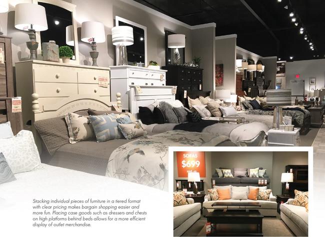
Outlet spaces tends to be stacked high with less room for maneuvering
through the space. Successful outlet spaces are more densely packed than
in regular stores.
- Warehouse racks are popular for stacking sofas.
-
Carpeted platforms are useful for stacking case goods behind beds.
-
Vertical racks are an easy way to display multiple mattresses.
-
There are more individual pieces and fewer accessorized groupings.
-
Discounted accessories, lamps and pillows are often grouped together on
their own shelving displays in outlet centers.
Despite the packed nature of outlet spaces, it is important to make them
easy to shop. Platforms and other stacked merchandise displays are worth
using. Spaces need to be dynamic, interesting, and exciting so customers
feel like they are finding a bargain or something unique. Creating this
kind of energy in your space is what makes discount shopping fun.

Instead of putting all discounted mattresses in their Outlet, for
example, Mathis Brothers displays last year’s bed models in vertical
racks within their existing mattress departments.”