The intent of the display was to inspire home furnishings retailers to refresh windows and in-store settings.
For the fifth consecutive year, Pierre D’Anjou and André Caron had the time of their lives conceptualizing and assembling home furnishings’ cream of the crop, mixing, matching and creating a sparkling gin fizz to die for! Their Trend Display was once again an important happening at The Canadian Home Furnishings Market in Toronto to the delight of the 12,000 attendees. They flock annually to see the latest collections of the more than 400 manufacturers who take space at the vast International Centre, the Market produced by the Quebec Furniture Manufacturers’ Association. The doors of the 75 permanent showrooms of Canada’s Furniture Mart are also open wide for the show, the owners eager to display their treasure trove. 660,000 square feet of furniture and accessories to explore, plus The Display at the heart of the action!
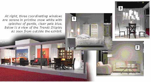
The intent of the Display was to inspire visiting retailers/buyers to refresh their own display windows and in-store settings, to not only attract consumers but also enable them to “see” the pieces in their own living space.
The Furniture Market has never been open to the public but, by utilizing the potent magic of The Press Pass, we were able to invade the sacred precincts and talk with Pierre and André. In fact, we found them leading tours of enthusiasts through the Display.
It was a different dynamic this year. The new platform, which supports 16 windows, is elevated 12” and set at an angle. Inspired by 1960s style, it has a unique feature; in addition to travelling around the structure, one can walk across it, discovering four more windows en route. The windows are all connected via intriguingly placed openings. Some have relevance to one another, coordinated colours, styles and accessorizing that suggest either a section of a house or apartment, or an area of showroom display. Many are divided only by sheer, white curtains that move as one passes and add life to the fantasy. The 12 “outside” windows and four “inside” windows represent the main rooms in a household. As before, construction was achieved in wood, a square 48’ x 48’, ceilings 10’ to 12’ high, all white with gray columns, and carefully arranged lighting creates the illusion that the Display floats.
“It took four days to put it together,” Pierre said, “one for setup. The project had to be tightly coordinated, we had to be ready, the manufacturers had to be ready, and it worked! Everyone was really happy.”
We asked the source of their inspiration. “Every year the concept has been quite different and it evolves through my work as a stylist and André’s as a teacher. We go to Milan, we go to High Point, everything falls into place. We love to work that way, to look a lot to find the right piece, to find new objects. We do everything together as a team, talk it all over and never make decisions alone. We want to present possibilities, stir the imagination of the viewers. It gives people a chance to see what’s new. Most people, even long time retailers, cannot visualize without a setting.”
What are trends anyway? Some sage said they are “concrete formulae for change, new ways to look at ourselves, our needs, likes and dislikes, patterns that project future growth”. With that in mind, what sprang into focus immediately? Our seemingly universal passion for good times past, in this case the ‘60s. “White is very big, baby blue very contemporary,” said Pierre.
Three coordinating windows are serene in pristine snow white with splashes of gentle, clear pale blue. There are lots of horizontal lines in the first display (photo #1), a calm but pretty bedroom. The slats in the headboard are reflected in the two tall chests, the look somewhat minimalist, the lighting cool, the linens splashed with blue. Both the Dinec bed and side table are on casters for easy mobility.
The adjacent livingroom setting (photo #2) livens up with a “very optical textured wallpaper, more important than ever for 2004, circles, white on white, that can be painted and that we also used on the floor, of course, only for display. It has a three-dimensional look and there is emphasis this year on papers one can create effects with.” The Jaymar chair and loveseat are in glove soft leather, the interesting occasional table is a Huppe design.
The dining area (photo #3) features a round Trica gray metal and glass table, chair seats in white fabric. Echoes of time past with the circular white shag rug by Concept Carpette! One of the hits of the show was our designers’ confection of wire and paper, inspired by Ingo Maurer, randomly arranged and suspended over the table. His lamp, similarly styled, is priced at “$2,000 or $3,000”, but the “look” can be achieved with “30 pieces of white paper, some plain, some with poems written on them,” and judiciously bent wire. (No, not duct tape!) Lighting brings the mobile into focus and the stark white is reflected by the vase on the table. Said Pierre, “This is something you can make for window or store displays or at home for a birthday or anniversary celebration, a happy deception!”
More coordinating themes, flowing into one another, begin with a sitting area, centred by Coja’s rich leather chair and ottoman (photo #4). Walls and floor are painted, and the warm colour blends are dark red, yellow and orange, based in dark brown. Drinking glasses in the Karya wall unit are red, and the unit’s glass door is framed with aluminum and contains glass shelves.
As always the Sofa International collection is both fun and flexible. The big bed in the neighbouring “window” can be used as a sofa with its two moving headrests and tables (photo #5). Wall art is a target, red, black and orange, and the wall itself and the floor are white sparked by halogen high tech lighting. These windows, taken together, could form a studio apartment arrangement on your floor.
Again, glowing red/orange, this time in a Meubles Italdivani faux suede sofa, poised on steel legs with a wood and metal base (photo #6). The seat can be raised to create arms, and the luxurious suede is easy to clean. The structured table is Lebel Creation, the lamp an Oggi Design.
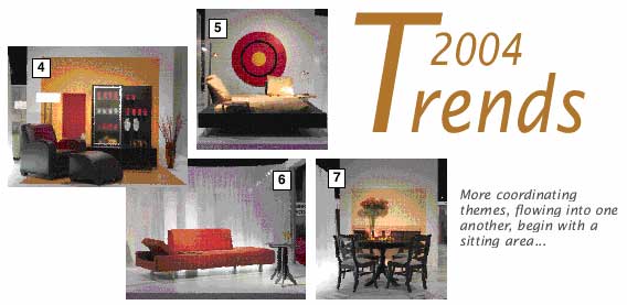
A different direction in styling by Gibbard Furniture Shops, one of Canada’s oldest and most prestigious firms (photo #7). “This dining room conveys a respect for design and tradition with a fresh twist, good coordination.” The floor is white, white sheer divides this setting from the previous colour shock and, the surprise eye candy, leaves in copper or light orange.
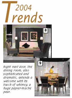
Right next door, Picasso holds sway in black and beige, matted in beige on a stark black wall. The Alexander Julian/Décor-Rest sofa (photo #8) is white with black and beige toss pillows, chairs are neutral natural, as is the carpet! Cool, controlled sophistication.
The dining room, also sophisticated and dramatic, extends a welcome with its touch of whimsy, a huge papier-mache pear (photo #9). It’s complemented by an arrangement of veritable pears perched on the lazy Susan, the centre of the round Bermex table. Pierre commented, “People will not feel invited, will walk on, if you stay too conventional, if there’s nothing interesting happening. You must provide incentive for them to stay.” Glasses on the table are orange, the chair seats are black contrasting with the light wood. The floor is white and once again, there is a sheer white curtain as background.
On the other side of that curtain lurks a young student’s space, a comfy Morigeau-Lepine daybed (photo #10). Calendar art, many different, amiable dogs, adorns the wall behind the bed, affixed by red pushpins. The linens are multi-coloured, warm, primarily red, and the wall and floor are both painted in vibrant South Pacific teal.
A large, colourful painting by Montreal artist, Elise Caron, focuses the attention and finds perfect foils in the Silva black leather, tufted sofa and chair (photo #11). Accessories reflect the painting in orange and black. The architectural lines of the Oggi table pull it all together.
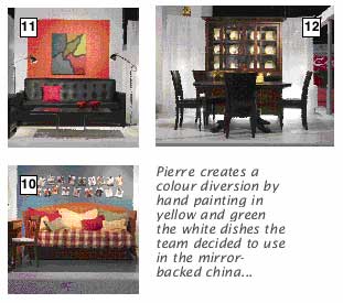
Pierre creates a colour diversion by hand painting in yellow and green the white dishes the team decided to use in the mirror-backed china cabinet in the next “room”. A Le Meuble Villegeois dining room (photo #12), the chair seating and table are in dark brown finish, the white curtain floats behind the setting and the floor is also white. The china cabinet is unusual. There is a shelf that extends so the piece can also serve as a sideboard when needed, a great feature.
There’s a real feeling of fun in the four “internal” display areas. The “Buddy Lounge” shows two identical Romano chaises in cowhide pattern fabric, beige and light brown, each on its own “shelf”, one above the other (photo A). Paint colour is delightful Green Frog, and there’s a rope, a cowboy hat and a play horse simply begging for action!
Next is a bed right out of a dream sequence in a Blue Baroque-painted cave, dozens of tiny mirrors hanging, mobile-like, from the speleologist’s “roof” over the perforated stainless steel Amisco sleeping unit. The chrome lamps are shiny, other worldly (photo B).
Now another cave, this in deep Raspberry Pie, the height of luxury with Korson’s silk upholstered classic chair and three, small accent tables mounted on the wall (photo C). Each table carries candelabra, shaped like antique chandeliers. The dazzling colour mix is fuchsia, orange and, of course, raspberry, warming, welcoming, fun.
The final display (photo D) is a preternaturally neat teenager’s bedroom. South Shore Industries have designed the tallest asymmetric storage wall ever, the very top one for seasonal bits and pieces, I decided. The bed and the table are both on casters, and the bed boasts a kid-pleasing cork headboard, perfect for posters, reminders and souvenirs. Walls and floor are just right in Voodoo Green, picked up by the multi-coloured flowers Pierre and André stuck in the ascending shelves. “Better for display purposes than the usual books and objects,” said the team. “For retailers certainly easier and cheaper, more effective and fun.” The reds and greens are picked up by both linens and the perky flowers.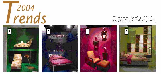
Some special thoughts from André and Pierre? “Look for the dramatic,” they insist. “Choose large, vibrant art. Look for huge, interesting objects, like the pear. Discard your tired old accessories, put them in the attic, give them a rest. Most of all, you know the old maxim, KISS, keep it simple, stupid!” they laughed.
Consumers who need direction should be told by your salespeople to “Look for what they truly enjoy, classic, contemporary or a mixture. Modern accessories can sometimes spark up a traditional room and look really great as can unusual colour choices. Whatever you do, make it for YOU. Are you a fly fisherman, for instance? If so, use lures, lines, rods, in your décor. Remember it’s YOUR HOUSE. Always zero in on something fun, something that will make you smile. Enjoy your home more. Good décor is like having the sun always shining through your windows!” Bet it works.
These remarkable men have excellent credentials. They’re two of the top designers in North America. Pierre writes for Canadian Azure and Interieurs; André has a long association with Cirque du Soleil and both teach design. Pay attention! And note that one of their favourite words is “Fun!” And that goes for both retailers and consumers!
(Throughout the Trend Display, there were certain constants, i.e. most lamps were by Luminara; mattresses and box springs, Sealy; linens by Jonatex; all paints by Laurentide Industriel; wallcovering by Decorlux; rugs by Concept Carpette Inc.)