The Pantone Color Institute Introduces PANTONEVIEW home + interiors 2019
Furniture World News Desk on
3/19/2018
 This annual trend forecasting product is developed specifically for the home furnishings and interiors market by the Pantone Color Institute.
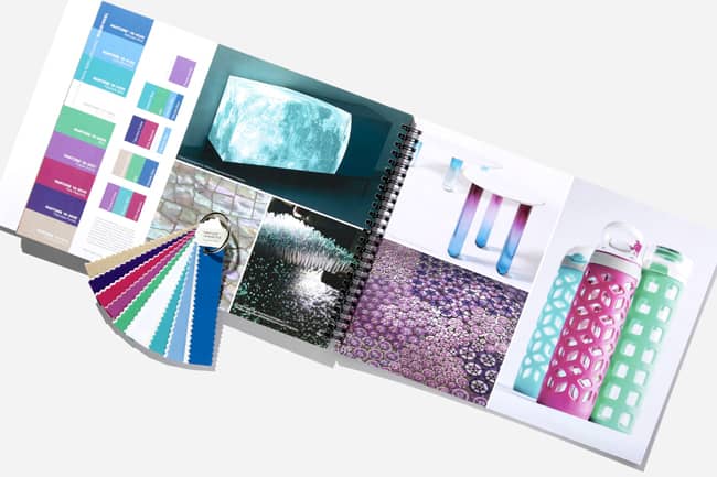
The Pantone Color Institute recently released their annual trend forecasting product, PANTONEVIEW home + interiors 2019. This annual trend forecasting product focuses on the colors that are next: the colors we will crave, the colors we will demand, the colors that will engage our imagination and appeal to our emotions, and the colors that will capture the consumer’s roving eye and convince them to make a purchase. Containing visual inspiration, key color direction and suggested harmonies distilled into eight themes with seventy- two forecasted colors, PANTONEVIEW home + interiors 2019 is a color road map to the future.
Two of the highlighted palettes within the 2019 edition include:
CRAVINGS will tempt the eye as well as the taste buds with spicy reds, sweet flamingo orange and rich purples. Seductive allusions to “fetish foods” deepen the irresistible message of the palette. The neutrals of tasty Butterum and Cappuccino serve up a delectable warming presence, while grassy green promises a cooling respite from the heat of the surrounding shades. These exceptional flavors will draw upon memorable sensory experiences to inspire new ones that will be just as pleasing.
Just as the name implies, the hues of
CLASSICO are fundamental, basic, and everlasting, while at the same time, elegant and forever fashionable. This is the palette where a graceful swan white and camel-colored tan co-exist effortlessly with deep teal, chic gray flannel, burgundy red, and caviar black. Rich gold and apricot brandy provide finishing elements to a color language spoken worldwide, across product categories and throughout all levels of the marketplace.
Each annual issue of PANTONEVIEW home + interiors provides targeted color direction for home furnishings and interior design. Housed in a new format, including a cover slipcase, nine individually bound eight-page palette cards, our 2019 forecast contains key color palettes, suggested color mixes and visual inspiration. The PANTONEVIEW home + interiors forecast is supported with Pantone
Cotton or Plastic Standards for soft and hard home applications.
For more information about PANTONEVIEW home + interiors 2019, click
here.