A little bit of whimsy can make the sale!
Retail Trends by Janet Holt-Johnstone
Overheard at the last Canadian Home Furnishings Market in Toronto, while walking the corridors of the International Centre:
“Remember those big white lamps that looked like the Oscar statuette?”
“Yeah, real attention getters! I tried to pick up a couple for my introductions vignette, but they were sold out. But, believe it or not, I did use a few of the inflatable pink flamingoes, a big potted bamboo that used to sit in my office and a really knock-your-socks-off turquoise backdrop. A bowl of pineapples and bananas on a side table. A ‘tropical’ setting for the rattan collections. And piped-in Bob Marley singing reggae, of course!”
“Did it work?” she asked.
“Sure it did! Got plenty of interest, and a lot of laughs. And we moved some rattan! Customers stayed longer to talk and look at other stuff.”
“This year the guys had you standing in the middle of a huge clock surrounded by 12 displays, bright colours and big numerals....“
“Timely, eh?” he laughed. “And did you see the hula hoops? Can imagine those in the kids’ section...“
“Why limit it to kids? Toss a few hot pink hoops on a chaise and I betcha someone would pick one up . . . .”
“One thing that impressed me this year was colour. I wouldn’t think of blending fuchsia and orange, but it worked! And what Pierre said about paint, ‘the cheapest, quickest mood changer around’. He’s right! That back space in my store, now if I.... “
And they turned the corner, back into Hall Two.
Trends Display designers, Pierre D’Anjou and Andre Carron, would high-five! The retailers got the point. The customers’ “must-have-it”, “love-at-first-sight” vibes need to be activated.
Showrooms have to be the 21st century’s equivalent of Aladdin’s caves, so irresistible that customers will enter and be mesmerized by the colour, the glamour, the excitement (as well as form and function!).
And then insist on transferring treasures from our galleries to their homes. Same day delivery! The challenge is to first create the sparkle, then perpetuate it, change the lure, don’t let the sizzle fade. Reinvent the ambience often enough that your customers’ curiosity is piqued.
It’s more than a decade ago that Pierre and Andre were asked to conjure up the first Trends Display for the annual Toronto Market. “We’ve always had a great reception, but this year it was even better, more people, more action, stronger, more dramatic.
“Retailers were taking pictures every day, very gratifying! They said, ‘We walked over to see what you are doing, we came for the inspiration!’ Right on.”
This year they were joined by lifestyle and décor expert, Janette Ewan, much to the approval of Pierre and Andre. For years, Janette has been reporting on the hottest design trends for Canadian style publications, including Chatelaine, House & Home and national daily newspaper, the Globe and Mail.
She is currently the co-host of “Inside the Box”, the W Networks’ programme with Ty Pennington. Janette was dubbed the first-ever ambassador for the newly named “Quality Canadian Furniture Trends Display”.
About the Display she said, “It was a hit! Pierre and Andre are Canada’s renowned design geniuses. The concept, I loved it, everyone loved it. It encouraged us all to think out of the box, to use colour, to bring life to their displays.”
She was thrilled that the Romano Tribeca sofa (photo #4) was designed and built especially for “legendary ABC Carpet/Home of New York. It’s a super-hip showroom and here’s an example of Canadian Quality Furniture occupying featured space! It’s a trendy gray and the vibrant yellow background truly bounced it out. You couldn’t just walk past, you had to stop and really look at it!”
This Markets’ emerging trends? “The shapes, triangles and crescents, colours are pastels and bold jewel tones. And styling? I saw rustic wood with concrete, not sure what to call this!”
The retail reaction? “They were all saying there was so much great stuff; it was very busy and you could tell buyers were confident spending. And designers were pleased and impressed; there were a lot of fresh looks on the show floor as well as in the Trend Display.”
And back to the Display; what techniques and tricks will create sizzle this season, what will draw customers in and convince them to buy?
“We conceptualized a giant clock; twelve stations forming a circle around a magical black platform floating 10” from the floor that provoked a leap of imagination into each station or vignette. We used a lot of glass, translucence and reflection of light. The back of each vignette was shaped like the clock and, of course, each vignette is numbered.”
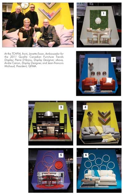
“One o’clock (photo #1) and spring has sprung, or summer if you like! A fresh, vibrant look with a large expanse of emerald grass paper tile on the wall, centered with a sunburst light fixture in white plasticized paper. The Dinec table is maple in a warm beige finish, the chairs upholstered in white fabric. On the table there are two rope balls in a strong yellow, waiting for you to play catch! And we’ve wrapped the plates in grass paper to ‘shake hands’ with the wall hanging.
“Two o’clock (photo #2) shows a strong metallic trend in the silver back panel and the three Umbra clocks, glass with red hands and silver faces. The area carpet is silver gray and the SoHo lamp, more metal in a cosmic shape. Another dash of flash in the cushions and resident robots, sparking bright red Palliser Ronin tuxedo chairs and the small blue lacquer table echoing the dominant blue background. Get working toy robots if you can, the kind with batteries that move about and make strange noises! The cheapest time to buy, right after Christmas.
“Three o’clock (photo #3) and the numerals have gone wild on the deep gray Midi table, like Alice in Wonderland, waiting for the Mad Hatter! The wall unit is also Midi, also deep gray. The backdrop is sun yellow, the rug and runner orange. And the inside of the aluminum drop light is orange, too. The vertical SoHo lamp has moveable small squares, also numbered.
“Here’s Janette’s favourite,” (photo #4) said Pierre. “Romano’s low sofa, gray, a Pierre design for ABC of New York; the V wall shelving? My design against the yellow backdrop, a feeling of flight, and there’s the model plane as emphasis, the fluffy yellow pillows to cushion your fall! The chrome SoHo floor lamp replicates a commercial photographer’s portable light.
“We used that gorgeous indigo again as backdrop and floor for five o’clock (photo #5). (All the wonderful paints come from Benjamin Moore, such a great range of colours and tones!) One of Amisco’s bright, light dining groups sits on red, commercial strength carpet with computer cut-outs so you can see the floor through it. Table base and chair frames are pewter. There’s a horizontally placed silver-framed mirror on the floor propped against the backdrop for playful reflection and, more play on the wall, a series of pink hula hoops, the ones those people in the hall liked! I cut a few up and stuck them in the vase at the centre of the table to continue the theme. And I love that big, red clock, eh?! Got the hula hoops at a dollar store, total cost $10.
“Six o’clock (photo #6), drinks time! The white rings on the indigo backdrop; I bought those rings after Christmas at Ikea two years ago, $5 each. You have to keep your eyes open, never know when you might pick up something useful. You don’t have to spend a fortune! Isn’t the throw a perfect match? And look at the blue, white-ringed rug! The white sectional is by Jaymar, the collection is Winslow. And the small stainless steel and wood topped Uno table is a Romano creation. The vases, candlesticks and other accessories I discovered at Winners, another sale!
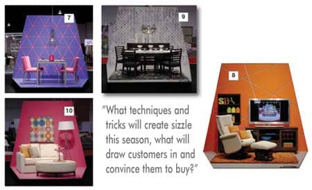
“After drinks, dinner! Seven o’clock (photo #7) and the table’s set, Trica’s silver gray, but it can be any colour you like, again metallic and with a shiny black top. The chairs are interesting; inside each back there is elastic that molds to your body when you lean back, very comfortable. The sea blue backdrop is grooved with intersecting pink lines, like the chairs’ pink fabric covering. The clock and glassware are pink and an attention-getting pewter-wire light fixture, also in the pink!
“Eight o’clock (photo #8) and your favourite television programme, this time warm oranges and mellow yellows! And take notice of the accessories in the South Shore wall unit; don’t miss a single opportunity to provoke sales! On your showroom floor, accessories are the easiest pieces to change frequently, and they’re tried-and-true affordable impulse items.* Dutailier’s welcoming Avant Garde glider-recliner and ottoman are graceful invitations to relax.
“A very sophisticated setting at nine o’clock (photo #9)! Again shimmering metallic, flying to the moon stuff! The Canadel table, chairs and sideboard, black and grey on a black and grey shag area rug. The backdrop is wallpaper, photo grey metallic circles, reflected in circular mirrors incorporated into the chandelier. We found the three vases at IKEA and stacked white dishes as centerpieces. There was a lot of retailer response to this vignette, many photographs and discussions about the use of reflection in display. One said it was a great idea because the customer will literally ‘see himself’ in the setting!
“Ten o’clock (photo #10) and what a bright and happy mini-world! Hot pink, one of the important colours, a painting from Winners that echoes the wall and the candelabra (painted by me!) also from Winners. The metallic SoHo lamp casts deeper pink shadows on the wall, and all of this frames the Décor-Rest loveseat and ottoman, Steven and Chris designs, clean lines, the loveseat with a front curve like the ottoman, off white leather. Just a touch of orange in the toss pillow.
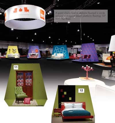
”More sparkle as we approach the witching hour! Swarovski crystals on the lime green wall, interconnected by pink cord to form a pattern. The chair, peppered with crystal studding, the Continental by Windsor in apple green, and the rose floor cushion relates to the pink pitchers and roses in the West Brothers’ cabinet. A pleasing 11 o’clock (photo #11) interlude!
“And midnight (photo #12) and time to go to bed, a red frame and headboard with metal legs and sumptuous French linens. But I bought the blue throw from IKEA! We decorated the green backdrop with inexpensive felt, the 3D red and green squares. The nice lamp, Après-midi, is green, anodized metal.”
Natalie Papia, President of Zilli Home Interiors in Woodbridge, now in her third year of business, was right on the mark when building Zilli’s marketing strategies. Dotted about the three floors of her stunning store are caches of accessories of all sorts. Her slogan, “Rooms to inspire . . . Indulgences to love”. Customers would be hard pressed to ignore her delectable pick-me-up “Indulgences”.
She was impressed with the Trends Display and felt “the lighting was great and each display had its own unique look. The colours were bright and cheerful, innovative with fresh ideas. Certainly successful in showing the trends and providing a quick glance at some of the best in the Market. A useful tool for retailers.”
You’ve found Paul Dekker, President of Conway, occupying space in our previous issue, one of the ongoing history series initiated more than a year ago to commemorate Furniture World’s 140th anniversary. He was pleased, too, with the impact of the Trends Display, and came away with the thought that he “could certainly use more whimsy. But since we’re located,” he said, “on a highway where traffic rolls by at 90 kmph, (kilometres per hour), 200 metres (about 600 feet) away from our windows, we’ll apply our whimsy to in-store displays!”
It’s time right now to engage your customers’ imaginations, delight their senses, connect with their ‘must-have’ impulses and close the sale(s)!
Buying furniture should be fun.