That’s good news if your store exterior and front entrance convey your brand identity and set the stage for the shopping experience to come.
Store Design Magic By Martin Roberts
No matter how you encourage customers to decide to visit your store, once they arrive you need to get them to move past the front door. Your store exterior and the initial sights, sounds and even smells they encounter once they take a few steps inside, set the tone for the rest of their shopping experience.
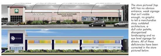
Customers judge your store very quickly as they view it from the outside and again when they first enter. If you are thinking of redesigning or renovating the exterior or entryway, you will, of course, want to add elements that attract attention and make your store seem inviting. In addition, you should also take a step back and consider what impression these changes will convey to your customers. Ideally, the architectural, graphic, lighting and color elements you add will immediately start to tell a story about your brand and give clues to shoppers about what kind of experience they can expect. We humans are story-making creatures, so if you fail to tell the story you want customers to hear, they will make up their own story about you.
Exterior
First things first: create a welcoming exterior. If you don’t, your potential customers will never know how wonderful the inside of your store may look, because they’ll be off shopping at your competitor. It is true that you never get a second chance to make a first impression. What your store looks like on the outside communicates worlds to your customers on both a conscious and subconscious level about what they’ll find inside, whether you’re speaking their language, and whether you’re the kind of store they want to shop in.
Many exteriors look dated and stuck in the 80s with architectural details like porticos, arches, metal roofs or stucco. Others just lack a cohesive look. One large furniture retailer, for example, operated four distinct buildings along a street, the result of gradual expansion. This exterior presentation was confusing to customers. Painting the exterior a solid blue color solved this problem. This unified the four spaces, made the store look bigger, more attention grabbing and identified it as a retail destination.
Other exterior elements to consider are signage and logos. Logos should be simple, clear, and in a customer’s line of sight as she’s driving past your store. A monolith sign at eye level, three to four feet in height and illuminated, makes for easy way-finding. Anything that’s too high up can get lost in the landscape. Also consider putting more space around letters to make them visible from further away. And make sure that your logo appears above your entrance, to identify it and keep customers from getting confused.
While you’re focusing on your entrance, celebrate with canopies, awnings, 3D elements that stick out and create shadow lines — anything that draws attention. Many of these elements do double-duty by sheltering customers from wind, rain or snow. Graphic elements on the outside of your store, such as murals, friezes or windows create a unique look and can easily communicate the type of merchandise your customers can expect to find inside.
Changing the profile or silhouette of the building can also make it more memorable. Simply raising the parapet, changing lighting or painting the store a fresh, light color gives you a new and updated look. Get rid of, or cleverly hide, eyesores like rusty air conditioners, telephone poles, or dumpsters.
Creating green space outside your store also makes it more inviting, and these days, landscaping doesn’t have to cost a fortune. Pampas grasses or zebra grasses can be used to create a sense of serenity but don’t cost much, and they also blow in the wind, creating movement and attracting customers’ eyes to your storefront. If you don’t have the space for landscaping, a few nice planters by the entrance with some color in them can make a world of difference as well.
Changing your message to better reflect what kind of store you are and what you have to offer can be done from the outside in. No matter how you communicate your message, customers should it from 100 yards away.
Interior entryway
Once inside your store, customers should find a continuation of the message you revealed to them outside; it’s not enough to do a few simple tricks to freshen up the outside and then disappoint customers once they cross the threshold.
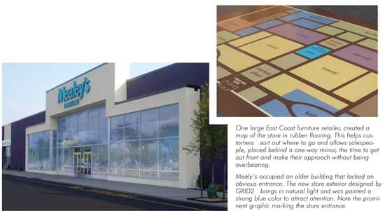
Video research shows that customers take three to four steps into a store and then pause, taking in the experience you present. They take stock of what you have, and determine in an instant what they should expect based on neatness, cleanliness, lighting and navigational cues. In an instant they also judge the price points they can expect to find, and the path they might follow if they decide to continue into the store. This is why a thoughtfully designed decompression zone at the front of your store is so very important. Any help you can offer customers at this point will be appreciated. One large East Coast furniture retailer, created a map of the store in rubber flooring. This stops customers in their tracks upon entering, and helps them sort out where to go. It also allows salespeople, placed inconspicuously behind a one-way mirror off to the side, the time to get out front and make their approach without being overbearing.
Your welcoming area can include an index of displays and visual cues that will not only tell customers the type of store you are, but also explain what you carry and how to find it. Signage in this area that explains about in-store events, specials, sales, and the brands you carry will also give customers a sense of what’s beyond.
Graphics, lighting, architectural elements and color used on the outside of the store and in the entry area can be used in a thoughtful way to present an idea or story that can be expanded upon throughout the shopping experience. Think about your own story and what it is you want your store to communicate. Every retail outlet has its own unique personality, history and image, but often in medium or large size outlets, that message can get lost in all the space.
Consider new ways at the very beginning to clue your customers in to your extraordinary displays, especially in medium to large size stores where you have the freedom and the room to do so. If you display by lifestyle rather than category, then this “story” can be presented early on. This will get your customers predisposed to making purchases in your store that are attuned to their style of living, such as small apartment, empty nesters or young couples.
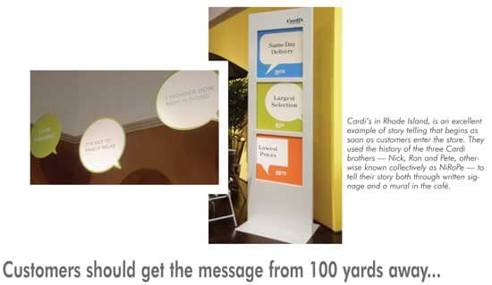
Cardi’s in Rhode Island, is an excellent example of story telling that begins as soon as customers enter the store. They used the history of the three Cardi brothers — Nick, Ron and Pete, otherwise known collectively as NiRoPe — to tell their story both through written signage and a mural in the café. Consistent signage employed the three brothers theme throughout. For interior signage they focused on what each brother is concerned about; one brother is focused on price, one on value, and one on selection. Color coded signage was used throughout the store so customers could easily see what each brother said about a given piece. Not only did this provide consistency of materials and added value to the customer, it communicated the information in a very human way that was easy to understand and relate to, and was also memorable.
This is story telling at its most ideal — a human connection that your customers can make with your store. But if you’ve done your job right, that story-telling began for your customers before they ever set foot in your store, with an introduction through more subliminal means; the color you’ve chosen to paint the outside, your use of landscaping, and your signage. And this message should be reinforced the moment they stepped foot inside, through the way your merchandise is displayed. Every store has a story to tell — what’s yours?
Martin Roberts is an internationally acclaimed design industry veteran, with over 40 years of credits for retail and product design.
With his staff of brand strategists, retail planners, art directors, graphic designers, web designers, environmental and industrial designers, Roberts leads his firm in interpreting brand DNA to the target consumer. The results can lead to increased customer loyalty and improved sales. GRID2’s projects with Borders, American Leather, TUMI, and Pathmark, are only a few examples of the success of Roberts’ tenets to empower customers to buy more, more often.
Roberts’ previous works included such nationally and internationally renowned corporations and brands as Bank of Boston, Barnes & Noble, Cartier, Chase Manhattan Bank, Coach, Duty-Free Shops, General Foods, Johnson & Johnson, K-Mart, Marriott International, Nestle, Perrier, Samsonite, Thomasville Furniture, Timberland, and Wal-Mart.
With a BA in Industrial Design Engineering and an MA in Design Systems, Roberts has also served as an adjunct professor of Design Management at Parsons School of Design.
Questions on any aspect of retail branding or store design may be directed to him at mroberts@furninfo.com.