A little bit of whimsy can make the sale!
This year, TCHFM (The Canadian Home Furnishings Market) celebrated its 40th anniversary. And in a perceived down-beat economy that on both sides of the U.S./Canadian border has been cautiously sneaking back up again, looking over its shoulder all the way! The Quebec Furniture Manufacturers’ Association (QFMA) hosted an unexpectedly optimistic gathering of buyers at Mississauga’s International Centre.
As has been the case for the past 12 years, a popular feature of the Market was the Quality Canadian Furniture Trends Display, orchestrated by world class designers Pierre D’Anjou and Andre Carron with their usual deft touches of magic. Everything was just a little bit brighter, a little bit more buoyant, a little bit more in sync with what retailers everywhere can do to attract consumers with that little bit of extra money in their pockets. It was a mini-survey telling us about “pent-up demand for home furnishings that will make everyday environments reflect great times coming”. OK!
And there really were smiles all ‘round, especially noticeable as groups and independents strolled amongst the Trends Display’s 12 vignettes, talking about where they could advantageously put that vividly chic purple sofa or those eco-friendly casegoods in their showrooms. “And how about those trees, real trees, for heaven’s sake, in that first display?!”
But there was an over-riding theme that couldn’t help but capture everyone’s attention, the focus on “Made in Canada”. Made in USA and Made in Canada are a big trend, so if you didn’t see the extensive section in the March/April issue of Furniture World on how retailers can position themselves to do a great job with this category, go to www.furninfo.com and read it. Remember the slogan, “Don’t let just anyone into your home”? And, “Buying Canadian furniture is ethical, trendy and eco-friendly”. Consider the designation, “Quality Canadian Furniture Trends Display”. Tags, proudly emblazoned with the Canadian scarlet maple leaf, were everywhere.
Pierre and Andre and Jeanette Ewan, too, back again this year with her new and dramatic Pop-Ups scattered throughout the Market, point to multiple ways and means to sell “quality Canadian” home furnishings, visually, intellectually, emotionally and even patriotically! All “designed and created to stimulate the imagination of retailers and provide them with inspiring merchandising and product ideas”.
Pierre walked us through four themed groupings, each with its own sparkle. “The starting point of this concept for us was architectural,” said Pierre. Twelve vignettes, four sets of three, each under its own roof.
Eco Theme
“Eco expresses comfort and eco-friendliness, as you would expect. The pointy roof lines could remind you of a hunting lodge in the forest?! And what do you immediately see? Trees! Of course!” The eco style focuses on simple, raw materials including white wood, wicker, wool, felt, raw cotton, handmade textiles (woven, quilted, knitted or macramé). It showcases local and recycled products, wood furniture with polished surfaces as well as reused objects. The natural colour palette focuses on earth, beige, sand, brown, brick red and soft green tones. The three vignettes pull this into focus.
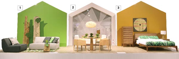
“Display One is powerfully green, ‘Iguana Green’, no less.” (A creation of Benjamin Moore, like all paints used throughout the Display.) High style, yet relatively small scale, the Cove Collection, designed by Rick Lovegrove for G. Romano, is built in Montreal using sustainable materials and practices. Good entertaining pieces for urbanites. The Tapis Waves Carpet, actually outdoor, was used for its style and colour. And those trees! By Colibri Art Design, actual old trees from the forest, cleaned, specially treated, all unique, individual works of art. The accent table is fabricated from the same wood with a glass top. And a neat touch, the huge green felt leaves attached to the trees and the table are placemats. Pierre can’t resist a touch of whimsy! Neither can customers. And so quick and easy (and inexpensive!) to add to your showroom display.
No, it’s not a depiction of the Northern Lights as Display Two’s dining room backdrop, or is it? This piece of nature-inspired decorative art was created from two, three, and sometimes five layers of one meter wide transparent mesh, overlapped in geometric formations and softly illuminated by the huge, natural wood central chandelier. The Viebois table is of solid birch in natura finish, the sideboard in opaque white and natura, is birch veneer with solid birch legs as are the chairs. The wood sculptures are fresh from Colibri’s forests!
Display Three continues the green theme in a striking bedroom, the attention-getting linens from Textiles Gauvin reaching out to ensnare customers with a predominant leaf print on pillows and counterpane. Huppé, designer, Joel Dupras, mixes the woodland with architectural elegance, tall, delicate and angular. The Moment Collection uses specially selected American walnut veneer and solid walnut components. (We understand that Joel’s mother is also a renowned designer, inherited talent!)
Eco-friendliness is part and parcel of the Alize gel mattress made from memory-foam infused with gel crystals, chosen for this and one other vignette.
If you are wondering how to put the backdrop together, find yourself a nicely shaped art frame at Winners, on sale, preferably, advises Pierre. The design is created with strips of green tape. Just follow your natural Instincts.
Getting Cozy
“Now we get cozy!”, laughs Pierre. Three more vignettes, these dubbed “Cozy”, boast another roof line, a modified pyramid; think of a child’s castle’s crenellations. “This style features candy-colored pastels that highlight a relaxed look, ideal for a family with young kids. Décor and accessories include light wood furniture, sofas with lots of puffy cushions, indirect lighting, mixed fabrics with small or large patterns. And consider floral prints in your showcasing, stripes and polka dots. The star product, the trend-savvy rocking chair.”
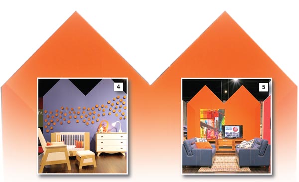
Display Four is a refreshing concept for the ultimate juvenile bedroom, the crib, dresser, and Russian birch rocking chair and ottoman created by Dutailier’s talented young designer, Melissa Veronneau. Take note of Pierre’s eye-catching wall design; it will delight shopping parents. And retailers will be pleased with its ease of application, a series of pink circles standing an eighth of an inch away from a south seas’ indigo wall, each pinned in place.
And in Display Five, Pierre and Andre have cleverly picked up on the casually stylish warm-and-fuzzy feel with Jaymar’s Todd loveseats. Imagine a comfy pair of blue jeans and translate that thought into an even more comfy navy leather, adorned with huge stitching in a very hip bright orange. The essential backdrop is in Festive Orange, dramatized by a spectacular Casa Luca room divider mounted on the wall. There’s a matching table. Dinec is responsible for the entertainment centre with its floating base. The orange highlight is picked up with toss cushions and, in case of sports’ night, more cushions boasting team numbers!
Our designers dining room, Display Six, perpetuates the warmth with Bertanie’s solid birch table and chairs (the latter structured for good back support and comfort), gathered for a family feast in front of an attractive and well-positioned Dimplex electric fireplace. The rosy backdrop reflects the fire’s glow. “Amazing how mood can be evoked with a simple coat of paint,” said Pierre. And the Zoe chandelier adds its own glow.
Pierre talked of the strong trend to knitting, hooking and all crafty hobbies, respected Canadian occupations for the past four hundred years during the long northern winters. Woolies are showing up in all fashion arenas, home furnishings as well as apparel. He used woolen scarves to drape the decorative vases on the dining table; how cozy can you get? A conversation starter in your showroom. And a subtle reminder of “Made in Canada”, a tradition to treasure.
Loft Concept
The roof style of the Loft concept vignettes is appropriately pitched at an industrial angle. Old factory buildings in many big cities have been transformed into ultra-trendy homes over the past decade or two. Pierre says his “look” is based on a “domesticated industrial style” and he’s geared it appropriately towards “trend-setting couples. Colours are faded, washed out shades and they include smoky-greys and grey-greens. Accent colours are vibrant cherry red, sun yellow, anise green and fluorescent orange. And for décor and accessories, the look showcases metal objects, extra-large pendant lighting, long tables and quilted fabrics. (Again, the quilting reflects Canadian tradition, both French and English.)
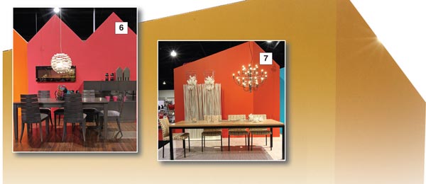
Lofts’ first vignette (Display Seven) is another dining room but with an entirely different temperament, expansive, plenty of elbow room. The Cubo table is large and in a black powder-coated finish with a natural zebra wood veneer top and a brushed steel base. Tops can be starphire glass, white quartz or wood veneer. The chairs this Market are giving thought to consumers’ comfort and Wave’s adapts instantly to any body shape in brushed steel or powder-coated, and 100 fabrics to choose from.
The accessories here are also large, vases four feet tall with huge flowers, the highly visible chandelier again by Zoe. (Pierre strongly suggests visiting Winners for their sales; he picks up so many items like the monumental vases that lend themselves to making statements of whatever sort you might envision and at very low cost.)
The bamboo floor is particularly interesting. Pierre chose it for its colour (many available!) as well as the eco-friendly sustainability factor.
Display Eight shows Palliser’s serene but enormous white sectional sofa, placed to view city or harbor lights from our Loft’s floor to ceiling windows. Fluid ultra-modern lines are backed by Surf Blue and Venezuelan Sea paint colours. This sectional can be configured any which way to suit consumers’ spaces, and your showroom space. Also, Canadian Le Present constructed the decorative shadow boxes that lend depth to the vignette; use them over and over again in many future displays, an infinite number of possible moods!
The ninth display is restful as all get out, yet there are industrial overtones in the geometric design Pierre conceived, using two gold tones, buttercup and dash of curry. Imagine the play of light and shade through those loft skylights! (Easy to do with a couple of cans of paint and spot lights!) The sleek symmetrical lines of the Mobican bed and chest define the laid back ambience. Thick white fiberglass sticks pick up more light, and the floor is bamboo, eco-friendly, beautiful, durable and available in a multitude of finishes.
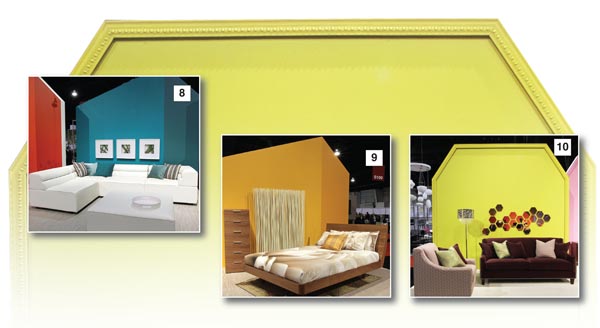
The Chic Look
“Chic’s” look is very continental, no-frills yet sophisticated style, ideal for mature couples, and it features contemporary furniture with easy-on-the-eye curves. Colour values are dominated by blends of white and beiges, the space can also be paired with light and dark grays or even a black and white duo, but, never fear, backdrops and accents are far from bland and boring. Draw your customers in with festive orange, rosy blush and dive-into water-drop blue, a spring garden, maybe, or a Caribbean festival! Lighting is diffused, there are small accent tables and long cotton or linen veil curtains soften the atmosphere.
In Display 10, Cobi Ladner really spreads her visionary wings with butterfly mauve shades in both sleek sofa and chair.
Refreshingly clean lines, elegant nail studs and again, the colours! Gibson plum and Corsica grape, backed by Pierre’s chartreuse backdrop. His use of a series of small shaped metallic mirrors (bought on sale, of course!) and a shag carpet for additional texture, round out the “chic” statement. Cobi, with her “cobistyle”, is one of Décor-Rest’s associate designers and a new talent at the design board in the home furnishings marketplace. For 15 memorable years, she was Editor-in-Chief of Canadian House and Home magazine prior to her decision just three years ago to fully utilize her design skills and develop her own line of furniture and accessories. And she, too, is an enthusiastic supporter of Canadian Quality marketing.
Pierre and Andre concocted a different, more interesting approach to the conventional arrangement of casegoods in a bedroom setting, magnifying the appeal of Durham Furniture’s “Made in Canada” Summerset Signature collection, Display 11. Plenty of glowing floral glamour against the “begonia” backdrop will draw customers into the display, to then become ensnared by the handcrafted artistry of solid maple, fluted pilasters, rope twist molding, turned feet and the soft shimmer of antique brass hardware. One utterly ‘chic’ and functional idea was that of placing a small desk beside the bed. Spaces these days sometimes demand unusual but convenient and still attractive solutions to customers’ needs, i.e. office space within the home that meets all criteria for aesthetic pleasure as well as work efficiency. A round solid cherry table lamp occupies the partner’s bedside table, topped by, guess what, a pleasing Gen-Lite lamp.
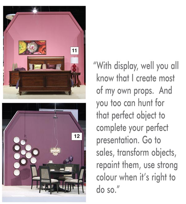
Display 12 uses the appeal of Passion Plum in painterly fashion, leaning on the 2012 trend to royal purples of all tones and shades. A tasty choice for a dining room that showcases Meubles Canadel’s flexible round table, chairs and sideboard, creations of Claude Lamarche. Against that dominant wall, the designers have arranged a treasure trove of dishes of various sizes and patterns, all classic. The plates and the vase were discovered at Winners, “a veritable Aladdin’s cave!” all on sale at $3 a piece! (Overheard, two retailers in conversation: “Look at that dish, it’s Wedgwood and my grandmother had that same pattern!” The answer, “Wonder if that sale’s still running?”)
After 12 years conceptualizing, researching, “the joy of the puzzle”, Pierre sees some changes in our volatile marketplace. “Finding interesting, innovative furniture for the Trends Display is easier now than it has ever been. All the manufacturers are doing something new, and it’s really nice, really pleasing. People are working harder to sell to the United States because of the bad economy and the currency fluctuations, and they are also working harder to sell to the Canadian market!
“I believe that eventually the economy and the currency idiosyncrasies will improve. An amazing sign of gathering optimism and confidence is the huge surge in condo construction in the City of Toronto, cranes dotting the sky everywhere! All those thousands of condos will need good quality, stylish furniture!
“With display, well you all know that I create most of my own props. And you too can hunt for that perfect object to complete your perfect presentation. Go to sales, transform objects, repaint them, use strong colour when it’s right to do so. And particularly look for the sales at the Winners stores, really nice accessories and paintings!”
Last year, Janette Ewen, Canada’s own lifestyle and décor expert, joined forces with TCHFM and became the first ambassador for the then newly named “Quality Canadian Furniture Trends Display”, as well as carrying a full load of print and television appearances. For 2012, she introduced her Pop-Up Vignettes, labeled as “A sneak peek at the hottest furniture and décor trends”, scattered throughout the Market’s Halls. They were designed, she said, “to stimulate the imagination and inspire new design ideas”.
“I’m still making appearances on CityLine (an hour-long morning television programme devoted to lifestyle), and also working both in the U.S. and Canada on various projects.”
Janette gave a popular workshop during Market, discussing merchandising, window display, point of sale purchases and other topics important to Market-attending retailers.
Her Pop-Ups, 12 of them, were all highly visible and provocative. ”Back to Black” was a standout. To quote Janette, “Slightly mysterious with touches of masculinity, this look is rich, luxurious, well-crafted and very dark. Imagine a 1920’s Park Avenue apartment with classic lines, full of dark wood, leather, velvet, intricately carved furnishings finished by culturally rich accessories . . . . timeless appeal and for those confident in their sense of style.” The fun of the Pop-Ups was in their singularity. Another, “Birds of a Feather”, was “Fresh, floating and feminine, taken from couture runways. A spirit of youth and softness. The feather motif brings a whimsical touch to the home. It’s a look that allows space to simply exhale!” And “Faded Chinoiserie”, another surprising and delightful reach, was “Taken from an era that embraced a sense of fun, excitement and wanderlust, simply a softer version of this now classic style of design. Muted pastels with muted patina, crystal, and gold and mercury glass complement the overall feel of the vignette.”
Janette recreated the Pop-Ups for the National Home Show. This time directed to the consumer audience, the vignettes provided them with a preview of furnishings they’ll see in stores later this year. And a very nice plus factor, Janette hosted a Cash and Carry Charity Sale. All the furniture and accessories in the Pop-Ups were donated by TCHFM exhibitors and Quality Canadian Furniture manufacturers. And all proceeds went to Food Banks Canada.
Her thoughts on trends in general? “Look for bedding in interesting aboriginal prints rather than dark jewel tones. Have fun with colours, particularly the oranges, the neons.”
A comment too, from colour maven Cobi Ladner after the Market. “I believe we are completely right about the consumers’ enthusiastic attitude towards the use of colour and interest in the home. Everyone’s fed up with a neutral world!”
A point made by the QFMA: “Furniture made in Canada is local. So it hasn’t travelled thousands of miles to reach your front door. Going green really can make a difference.” It’s part of the pretty universal “going green” message. And, it would seem from many sources, this is becoming increasingly important to the North American consumer as each year passes.
Janet Holt-Johnstone is retail editor at Furniture World Magazine.