Innovative lighting, colors, textures, accessories and furniture display ideas.
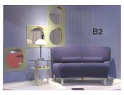
B2 Is Bathed In Blues, staging kidney- cushioned loveseat and end table, very trendy indeed with brushed metal legs.
There’s a magical time in the late afternoon when darkness is gathering and people are beginning to switch on lamps and overhead lights. Many don’t draw their draperies immediately, and if you just happen to be driving past, isn’t it fun to play “Peeping Tom”? You know, “Look at the gorgeous colours in that living room!” or maybe, “Golly, what a great wall of bookcases!” or, “Fantastic kitchen!” or, “What a horrible chandelier!” I bet you have. It’s human nature.
Pierre D’Anjou and Andre Caron are both designers and, effectively, psychologists, capable of sensing the way we think and feel. They are well aware of the importance of the exterior and interior “windows” used by home furnishings retailers to intrigue customers and help them visualize new approaches to interior décor complementary to their lifestyles.
The Trends Display they conceptualized, fabricated and ever so tastefully dressed at TCHFM, Canada’s Home Furnishings Market, was a remarkable exhibit, definitely “The Buzz” amongst the 12,000 attendees at Toronto’s International Centre. The annual show is produced by the Quebec Furniture Manufacturers’ Association.
Visually, it was a fascinating series of 18 oases of colour, each a lifestyle fragment, as refreshing as new wine after the grays of northern winter. The three circular elements amusingly appeared to float above the Market floor with the Windows’ level raised 12 inches for better viewing. The fabric of the triple structures was light, inexpensive, untreated vertical metal construction slats, each unit encapsulating six vignettes with reflective curved backdrops and pristine white floors. “To facilitate imaginative lighting and avoid distracting from the furniture or the colours,” they said. “There is a transparency, it’s warmer, enveloping, sensual and organic.”
Also refreshing was the actual presentation of furniture and accessories, assembled in an unexpected melange of contemporary and traditional stylings, in colours not always considered compatible and from a broad spectrum of Canadian manufacturers and artisans.
The designers’ concepts are firmly rooted in intensive research. Trends, after all, are concrete formulae for change, new ways to look at ourselves, our needs, likes and dislikes, patterns that project future growth. What the duo presented was a quirky gift, “a delightful surprise”, said one retailer. “A totally unanticipated approach with readily accessible furniture,” said another.
Pierre and Andre “shop” the High Point Market every October, spotting the new Canadian introductions. Those manufacturers who don’t exhibit in North Carolina are asked to send photos to Veronique Mear, Director of Exhibitions, QFMA, and to Isabelle Bleau, Publicist for the Market. They pass the images on to the designers, providing them with a real bird’s eye view of national offerings and, from this wealth of material, themes begin to emerge and concepts develop.
“We study and are inspired by everything around us in choosing colours, textures and accessories as well as perceived current trends. We travel quite a lot, read widely. This year, we focused on texture and nature, played out in many different ways.”
At the Toronto Market, there was an air of occasion about the red carpet leading down the centre of the huge Hall 5 to the triple structure and a sense of arrival with the dining room “window” directly ahead, the living room to the left and the master bedroom at one’s right.
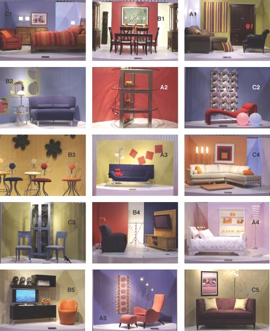
The designers’ dining theme (Window B1) involves “nature, flowers and leaves in art, floral/foliage arrangements and ceramics. The red backdrop is warm and welcoming to the people who will gather to eat and talk together.
“There are four different chair styles, much more fun than using matching chairs either at home or in a retail exhibit. For the retailer, of course, this also shows Canadel’s flexibility.”
Window A1, the living room, is a mixed invitation “offering both relaxation and stimulation”. The sage green, microfibre loveseat/ottoman and a more traditional leather chair, both by Décor-Rest, are sparked with ”inexpensive and effective” vertical multi-coloured striped fabric, “artwork” and toss cushions. A lighter, more acid tone of green backdrops Durham’s handsome armoire, designed to contain entertainment equipment or any households’ “multitude of sins”. The lighting adds some interesting shadow-geometrics and the orange “flowers” the whimsy so necessary “to make the viewer smile, the essential element”. The theory being that happy settings make happy people who, generally speaking, buy more!
Clear cool shades of blue challenge warm, mellow orange, scarlet, claret and gold, reflected in the carefully chosen art in Window C1. The clean lines of T & J’s contemporary mission bed and chest of drawers contrast well with the rounded Stylus club chair. Again, note the effect of carefully placed lighting.
Window B2 is bathed in blues, staging Huppe’s kidney-cushioned loveseat and end table, very trendy indeed with brushed metal legs. The mirrors are framed in this season’s acid green (or might we call it “eau de Nile”?), surprisingly softened with pheasant feathers.
A2 is an artists’ confection, cranberry red framing three stacked Oggi coffee tables, a novel display unit accented with nine yellow, red and green ceramic balls on brushed aluminum. Swirls of light from three little lamps disperse circles, triangles, squares, and rectangles galore.
C2 is retro all the way with a scarlet A-2000 Art Deco chaise longue, bubble gum pink and sky blue spherical lamps and probably the most interesting and functional wall treatment/magazine holder at the show!
Trica’s Alice in Wonderland fantasy bar/dinette stools are shown in five dynamite shades, blue, copper, gold, yellow and orange, and one of their many metallic finishes. The ceramic daisies, deep green on gold, are “vintage discontinued IKEA,” Pierre told us, “reduced in price. Look for things like this to use as accents. They’re out there, waiting for you!” Window B3.
Raoul, the Happy Red Bear, meditates in Window A3 on Van Gogh’s French blue sofa, all angles and squares, floating on its exposed steel frame. More whimsy in the casually scattered textured red tiles in orbit on a golden sky.
At C3, Andre emphasized, “Think off the wall! Don’t settle for ordinary solutions.” It’s “ordinary” to populate curios with dishes and serving pieces. Instead, develop a story and hunt for props. You’re setting the stage for your customer’s lifestyle. The designers found ravens (maybe crows?) that perch on shelves, chattering and examining attractive, free form copper-toned glasses. Silver blue chairs and curio are Dinec’s artistry and the subtly striped background adds greater riches in gold and copper.
Spontaneous laughter erupted when we reached Window B4. “Good evening sports fans, it’s hockey night in Canada!” quipped a retailer. The setting replicates the home theatre of a dedicated fan, Jaymar’s reclinable Jay’s blue seating with pullout glass holders, silhouetted against a brilliantly Canadien red wall. A state-of-the-art plasma television rests on Laurier’s entertainment unit, contemporary directoire with steel pillars. But, the piece de resistance, at the back of the setting are authentic crossed professional hockey sticks, and the rink floor design is properly executed in red vinyl. Popcorn was the one missing element, but Pierre confided that visitors had eaten it!
The fussiest little girl in the world would love Window A4 if it could be transported in its entirety to her home. Two wonderful spiral mobile shapes, reflected in the patterned bedspread, could fly her on command to Hogwarts every Harry Potter night. Slightly larger girls might not want to leave the comfort of the modified sleigh bed by A. P. Industries. The colour mix is unusual, strong tangerine with soft blue-pink and gentle tones of lavender, feminine but not fussy.
C4 is another great living room setting, a sweep of graceful sectional sofa supported by 21st century metal legs filling a corner with distinction, pale against a burnt orange wall. The trio of lamps is stark white, the artwork a cubist melange of blue, orange, scarlet, burgundy and white. Corner lighting soars and creates shapes in blue, and oranges are picked up in toss cushions. Why the exceedingly low “coffee table”? Well, we don’t want to mask the sofa, do we?
The action corner of an elegant home theatre is captured in Window B5. Another plasma television set, ebonized entertainment unit from Karyn Furniture, the background in soft green-gold, light-show-shadow-patterned, and orange-sparked with Italdivani’s ergonomic leather swivel armchair. The three smiling heads, each wearing perky headphones, are mind and eye candy.
The sensual curves of the elegant salmon armchair and stool by Montreal designer Aime Bouzaglou for William, is a standout against the deep violet blue space of Window A5. The chair is a striking objet d’art yet, with its body-hugging shapeliness, offers extraordinary comfort.
C5 is subtle, sophisticated, serene, an up-market combination of ‘20s plum and the green-gold of antique brass in toss cushions and wall décor. Vogue artwork sets the scene, enhanced with Silva 4 Home’s enveloping loveseat. Sky-seeking lighting lifts the spirit as well as the eye.
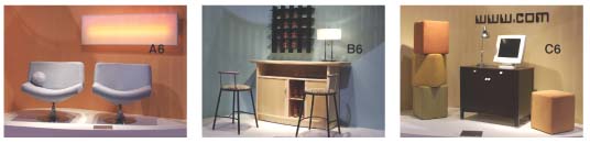
It’s Window B6 at the end of a hectic day, and corporate crusaders return to their at-home oasis. DFIC's sideboard also serves as an attractive bar with convenient disappearing doors. Amisco's stools permit comfortable perching and colourful glassware reinforces Celtic convictions. Light and shadows capture depths-of-the-sea calm.
If the February SADs have tempered your optimistic spirit, in Window A6 the designers suggest “easier, alive colours, oranges and two enticing powder blue occasional chairs by Romano, ‘60s inspired and circular chrome based. The huge therapy lamp changes colours to suit your mood, artwork capable of ‘moving your world’”.
Back to cubism in function for the home-based office in disguise. Romano’s Window C6 ottomans are softened with colour, apricot, pale moss green and antiqued gold, and the secret work space enclosed in Bestar’s minimalist computer desk, can appear and disappear at will.
Some helpful messages from the Pierre and Andre:
“Simplicity is crucial if you want the furniture to remain the centre of interest. Everything around it is only there to ‘serve’ the furniture and place it squarely in the spotlight.”
“Take a thoughtful look at the Windows, observe how certain accessories are used repeatedly to create a rhythm, understand the role of colour and texture, find inspiration in the ‘recipes’ and take it from there, making adjustments as needed. For example, to understand the importance of creating a rhythm, let’s take a little green watering can. Just one wouldn’t mean much, but seven watering cans in a row create an interesting rhythm.”
“Remember that display vignettes don’t have to be expensive. In-store you need light structures that can be shifted around easily. And raise the areas 12 inches off the floor for best customer viewing, a podium for special products. ‘All the better to see you with, my dear!’”
The designers, Pierre and Andre, are amongst the foremost practitioners of their art in North America. Pierre’s many splendoured talents include design writing for Azure and Interieurs Magazines, while Andre has enjoyed a long association with Cirque du Soleil. Both teach Design de Presentation at College du Vieux Montreal. This is the third time they’ve met the Market challenge.
Don’t let the Windows’ dreamlike quality fool you. Every bit of display savvy can translate into cold hard cash at retail
Note: Mattresses throughout the Trends Display by Sealy, lighting by Luminara.