Store layouts influence how customers interact with your merchandise and how much
they buy.
Furniture retailers need to have store layouts that draw customers in, circulate them around the entire space and show merchandise in an exciting way. The layout should help customers find what they want easily, encourage them to buy, and give them an overall positive experience.
All this cannot be achieved by chance. It requires a deep understanding of customer shopping behavior, sharp planning skills, testing, retesting, plus a touch of ingenuity. Creating an intentional and well-thought-out store plan is critical for maximizing revenue.
Store layouts influence how customers interact with merchandise, and how they buy. They are part of the brand experience that needs to be given due consideration. In this article, we’ll look at various types of store layouts along with the pros and cons of each. We’ll also share best practice tips and cover what not to do.
A Pinball Machine
Think of your store like a pinball machine. In the game of pinball, players send a steel ball through a space that contains flippers, bumpers, kickers, switches and rubbers to rack up points. Store layouts are a lot like that, except in the game of retail, customers are sent through a space in a way that racks up sales.
Modern pinball machines are designed as either “Flow” or “Stop-and-Go” models. The Flow model sends the steel ball along direct lines then loops it around and back. The Stop-and-Go model includes traps that interrupt the flow of the ball and redirect it along another path.
Retailers should employ a combination of these two models to plan store traffic flow more effectively. The goal is to loop customers through the entire store, slow them down frequently and redirect them along new pathways. This will lead to increased product exposure, higher dwell time in the store and more purchases.
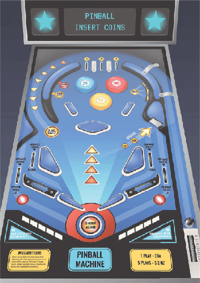
Think of your store layout as a pinball machine where the goal is to send your customer through the entire space to increase their potential to buy.
|
Customer Flow & Behavior
Store layout affects the way customers navigate and move through a space. The layout should work with common shopping behaviors and shouldn’t fight against customers’ natural inclinations. Start planning by observing how shoppers interact with your store. Watch where they go, where they pause, and what attracts their interest. Also, measure traffic patterns using people counters, video cameras, heat tracking software, beacons, and more.
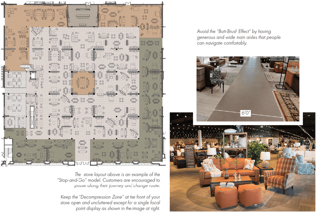
The Decompression Zone: When customers first walk into a space, they need a bit of time to get their bearings—a moment for their eyes to adjust to the lighting as well as time to look around, consider what they need and where they want to go. The term “Decompression Zone,” coined by Retail Anthropologist Paco Underhill, is the first five to 15 feet of your store. Keep this space uncluttered, free of signage and merchandise. Customers tend to ignore any merchandise in this zone unless it’s presented as a singular focal point.
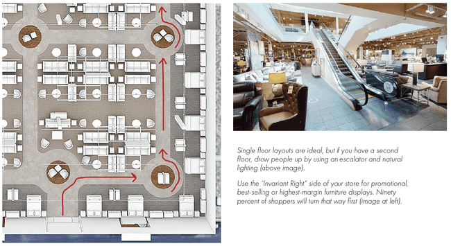
The Invariant Right: Once shoppers get past the “Decompression Zone,” they tend to turn right almost 90 percent of the time. People make this “Invariant Right” turn (a term also coined by Underhill), then tend to walk counterclockwise through the space. This is the reason why the right side of a store is ideal for displaying promotional, best-selling or high-margin furniture. It is also the best place to start any walkway that will take customers around your store. Don’t put checkouts, restrooms or customer service areas in this location.
Single Floor Preference: Shoppers prefer single-level stores. According to consumer behavior expert Claus Ebster, they are most comfortable shopping the floor they enter on. Stairs, escalators and elevators all negatively affect customer flow. In particular, customers find staircases daunting and off-putting. If you have a two-story space, put in an escalator and keep your high-margin products downstairs. Locate destination categories like kids furniture, home office and discount furniture upstairs. If you are shopping for a new retail space, it is best to avoid anything with a mezzanine or second floor.
Butt-Brush Effect: Wide and spacious walkways are ideal. The “Butt-Brush Effect” (also coined by Underhill) refers to any inadvertent brushing of one customer by another due to limited space. Main aisles should be 4 to 6 feet wide to give customers enough room to browse comfortably without being concerned about bumping into others. Women especially value their personal space, so wider aisles contribute to a more positive overall experience. Review your store layout. Check for tight spaces or bottlenecks that may prevent customers from getting to merchandise or other areas of the store.
Aisles & Circulation
Let’s revisit the pinball analogy. There are two primary types of store layouts that work best for furniture retailers. The first is the Racetrack Plan (pinball flow model), which loops customers on a defined pathway around the store and back. The Racetrack plan can be achieved with either straight run or curved/organic aisles. The second type is the Free Flow Plan, which in essence lacks defined aisles (the pinball stop-and-go model). This model lets customers define their own paths through the store but includes various focal points and interruptions to send them in new directions. Let’s review both in more detail.
Racetrack Plan: A Defined Loop
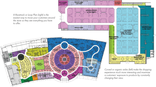
Due to the larger size of many furniture stores, Racetrack or Loop Plans are most commonly used. They loop customers around the entire store, guiding them through every department. The loop is defined by a pathway, typically delineated by a different color or flooring material. In furniture stores larger than 50,000 square feet, one inner and one outer loop with crossover connections may be needed to expose customers to all the merchandise on display.
Are defined aisles restrictive or helpful? When aisles are wrongly placed, if there are too many of them or if they are awkwardly angled, it may reduce the flexibility of a floor plan and limit the number of room sets. Aisles work best if they are only one or two-room sets deep off the perimeter wall. Defined aisles can present a psychological barrier to some customers, discouraging them from stepping off and exploring.
A visible and easy-to-understand loop can, therefore, help retailers tell their story as customers circulate around the store. It also assists in ordering the space and aids in wayfinding. Adding focal points and visual displays will help break up the walkway to make the customer experience more interesting. Perimeter walls are highly visible with Loop Plans so dynamic displays that look better with a wall behind them should be placed there. Taller product categories like bedroom, home office and formal dining can benefit from being placed along the perimeter walls.
Straight Run Aisles
If you have a two-story space, put in an escalator and keep your high-margin products downstairs. |
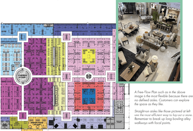
A Racetrack Plan with straight aisles is the most efficient layout for furniture stores. If laid out properly, it allows retailers to display the most room sets per available square footage. It also keeps room set layouts running in rectangular blocks, making them easy to configure and merchandise. It allows a good amount of flexibility. Straight run aisles work effectively as long as they are only two room sets deep from any aisle. Therefore, displays in the middle of an open space should not be more than four room sets across. Any deeper than that and a store runs the risk of looking like a sea of merchandise.
To make a store more shoppable it’s necessary to actively focus customer attention by breaking up the space into digestible chunks. Bowling-alley aisles are not ideal since they allow customers to race through the store without a reason to slow down. Adding feature elements and jogging aisles helps to break up long runs. Include enough cross-aisles so customers can easily switch over to other parts of your store.
Pros of a Straight Run Racetrack Plan:
- Very efficient layout; maximizes floor space
- Predictable traffic flow
- Easy to organize and display room sets
Cons of a Straight Run Racetrack Plan:
- Speeds up traffic
- Creates a boring experience
- Discourages shoppers from getting off the aisle
Curved/Organic Aisles
A Racetrack Plan with curved aisles creates a much more interesting experience. It constantly changes the viewpoint of customers as they walk along the path. And, it engages them with new displays along the way. This slows them down so they spend more time and ultimately buy more. Curved walkways help break down large open areas of merchandise and bring shoppers through departments they might otherwise have missed.
However, this kind of store layout can create awkward merchandising areas, so creativity is required to create efficient displays. Organic walkways may also disorient shoppers as they get lost along the curves and turns. And it can potentially frustrate people who already know what they are looking for and just want to get to a particular department quickly.
Pros of a curved/organic Racetrack:
- Slows down traffic; maximizes product exposure
- Keeps merchandise display pads from becoming too deep
- Constantly changes a shopper’s view; creates variety and interest
Cons of a curved/organic Racetrack:
- Layout is not as efficient
- Creates some awkward merchandising spaces
- May frustrate some customers who are in a hurry
Free-Flow: No Defined Aisles
Free-Flow Plans don’t incorporate permanent aisles delineated by color or flooring material. They are the least restrictive plans available to furniture retailers. These plans encourage customers to browse at their own pace in whatever manner they like. However, walkways can be defined by the arrangement of furniture displays.
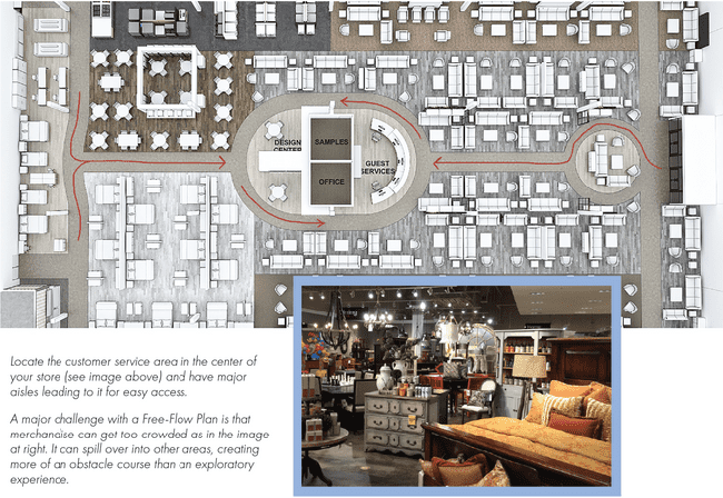
The Free-Flow Plan is a more modern approach to furniture store layout, but it requires more discipline to keep furniture from blocking the flow. And, without feature walls and focal point displays to break up the view, this type of layout can quickly turn into an obstacle course where customers cannot easily get to the merchandise they want to consider purchasing. Retailers also tend to over-merchandise these spaces, filling every possible square foot of space with product. This can create situations where customers get confused, have trouble finding what they want, get frustrated and leave the store prematurely.
Free-Flow Plans work better with smaller footprint stores, typically those under 20,000 square feet. However, there is a trend for larger retailers to experiment with them too. Larger stores may break down the space into discrete visual areas by, for example, placing the mattress department on a carpeted area or the dining department on luxury vinyl tile. This helps organize and represent areas within the overall space. Merchandising displays can be better defined by adding rugs under certain room sets. Movable walls provide backdrops for furniture groupings and attract customer attention.
Flexibility is the ultimate benefit of this plan because departments and merchandise can be moved around with ease to test where they perform the best. Retailers must take an organized approach to Free-Flow planned spaces. It’s important to carefully control how merchandise is presented. Laying out merchandise plans using a CAD software program and then testing the layouts rigorously on the sales floor will keep the space from descending into disorganization and chaos. And, with the right merchandising, the store itself will feel less sterile.
Pros of the Free-Flow Plan:
- Very flexible and easy to change
- Slows down traffic and promotes exploration
- Creates open sightlines
Cons of the Free-Flow Plan:
- Hard to impose organization and present room sets effectively
- Space can get over-merchandised and crowded more easily
- May overwhelm and confuse some customers
Store Layout Tips
Here are some additional tips to help you achieve the best customer experience for your store.
-
Move your customer service and checkout area to a central location in the store. This way, it can be seen from multiple vantage points and help customers orient themselves. Make sure it is easy to get to.
-
Eliminate any dead-end walkways. You should never allow a straight pathway to just terminate. Any defined walkways should always loop around in some way.
-
Do not allow your merchandising pads to get too deep. This discourages customers from exploring the merchandise in the center. Customers tend to shop the room sets that are closest to the aisle, so more aisles will get them closer to all your products.
-
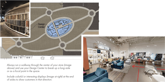
If you have a Design Center, make sure it is centrally located within your upholstery and motion departments. This colorful, eye-catching area can be a focal point to slow customers down or re-route them.
-
When implementing a Loop Plan, make sure you run a walkway up the center of your store. This helps customers find their way around, can easily lead to a central checkout area and helps certain customers get to their destination more quickly.
-
Make sure you have a focal point at the end of each aisle that draws customers towards it. You do not want warehouse doors, for example, to be that focal point.
-
Consider eliminating 90-degree corners on aisles. Use a roundabout circle instead, with a focal point in the middle to draw customers around.
Conclusion
By being conscientious of your customers’ natural behaviors and thinking creatively you can design a plan layout that guides shoppers around your store in an interesting way. If well executed it will also give you more flexibility to change room sets easily and quickly. Your customers will slow down their shopping experience, be excited by what they see and spend more time and money in your store.