3 Secrets To Make The Best Out Of Your Sickly Newspaper Circulation And Pour Traffic Into Your Store.
Retail Traffic by Brett Kitchen & Ethan Kap
Last month I received an email from an independent retailer that read, “I’m having a ‘My Best Year Ever Sale’ promotion.” Can you review my newspaper ad?
She’s had her best year ever for several reasons, but mostly because of her exciting, different, and compelling marketing. She uses newspaper along with direct mail, TV, internet, and more.

And even though newspaper circulation is falling faster than humpty dumpty off his wall, it still can be effective when done correctly. Another retailer is a regular newspaper advertiser because he’s negotiated such good deals on full page ROP that he can’t refuse, but if he didn’t use the system outlined below, he would probably be wasting a large percentage of his investment… no matter how cheap it was.
If you’ve been reading this series of FURNITURE WORLD Magazine articles, you’ve probably noticed that It often advises furniture store owners to steer their ad budgets away from the sickly newspaper to greener pastures like direct mail and online marketing.
BUT…this article isn’t about why newspapers aren't effective and why you shouldn’t be using them. This article is for those folks who are determined to use newspaper advertising in their media mix -- and how those retailers can get the most bang for their buck.
Of course in some areas and with some demographics newspapers still get read. Readership is declining, never to come back, but the folks over 55 years old are the most likely to read the paper. So if that is your market, then you may still be seeing good results from ads. BUT…even in that demographic, the web has a stranglehold on the paper, and will eventually kill it off.
To make the paper work, you have to look at this from the perspective of your customers… when they get the paper what are they looking for?
Are they excited to read up on the latest sports headlines? Are they diving into the travel section, or cutting to the chase and going right for the coupons. Of course they’ll probably read the front page, but beyond that, there is NO OTHER AREA in the paper that gets universal readership.
I still get the newspaper on the weekends, but I never even open it unless there’s a sporting event or something big happening. My wife just yesterday asked “Did you get the paper today?” I replied, “Yeah, but I threw it right in the trash.”
She said, “Oh, well I wanted to look through the ads.”
So there you have it. That’s your typical American family. In comes the newspaper (if they even still get it) and it goes directly to the recycle bin, with a brief stop on the table for ads or coupons. People are not reading the newspaper cover to cover.
So here’s rule Numero Uno about newspaper advertising in 2009.

Secret #1
Free Standing Inserts are one of the secrets to making newspaper advertising effective because they actually get read. FSI’s are basically a sheet of paper 8 x 10 that gives you real estate on both sides of the sheet to tell your story. It is inserted into the paper. It’s not ROP.
Here’s the problem with ROP. If your painstakingly designed, well thought out ad ends up on the 4th page of the ‘organic gardening’ section, how many people are even going to see your ad, let alone respond to it!
The first rule of marketing is GET THE AD READ! You can’t very well do this if your ad is tucked away under a rock in the back corner of the paper.
Your best chance of getting your ad read is by using inserts, not ROP. Of course there’s more to it than that. We’re just getting started.
Secret #2
Many retailers use a huge circular ad in the paper--118 pages of product and price, showing every piece of furniture or every mattress in stock. Most people know what a mattress looks like without your help, so while 118 pages or even 4 pages gives you a lot of nice real estate, most people don’t even use it to put compelling, interesting, benefit driven copy in it. BIG MISTAKE.
Your ad is your personal door-to-door salesperson.
Picture this for a second. A salesperson from a local store shows up at your door. He holds up a pretty picture of your sofa with a price on it. Then he proceeds to SCREAM at the top of his lungs...
“HUGE SALE, 70% OFF, THIS WEEKEND ONLY!”
Door -- SLAM!
How well would you like that? I think we’d all slam the door and tell him to never come back.
Contrast that with someone showing up with a dvd player on the front door saying… “Hello, I brought you an important video message about how a mattress can improve your love life, stop back pain in it’s tracks, help you lose weight, and make you more productive at work. It only takes 60 seconds!”
You: “Please come in, I’d love to hear more…”
Now there’s a good chance that many of your potential clients have one of those pains, or want one of those benefits. Now you’ve gone from a screaming pest, to a welcome guest.
Your ads must do the same thing. There’s a truism in the direct response advertising business and it says this; “The More You Tell The More You Sell.”
Getting back to the door-to-door salesperson example... You’d never send out a salesman and say, “You can only say 20 words… No one will listen to anything more than 20 words.”
It’s absurd. No one would sell anything, yet this is PRECISELY what people do with their advertising. The agency folks who consult with retailers have all learned in their ivory tower school rooms that “white space” means readership. Cute, clever slogans and logos make people buy, and ‘Product and price ads’ are what people want to see.
The teachers of this garbage and the people they indoctrinate with it have never spent a day in the real world. The world of convincing a prospect in the frozen tundra of Ohio to get off the warm and comfy couch, brave the snow and ice and come and spend their hard earned money despite negative 5 degree temperatures.
This does not happen with fancy slogans, cute jingles, white space, or pictures of your sofa with a price on top of it.
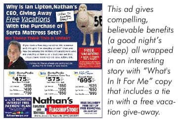
It happens because you grab their attention, and show the prospect the exciting benefits that buying will create in her life. Add to it an irresistible offer and a call to action and you’ve actually got a chance at getting some results from your ads.
Now I know from personal experience that most of the people reading this article won’t do this. That’s because it is harder and takes more time and thought than just popping in pictures and price. But, retailers who do the work and implement this secret continue to see response, where all others fail.
So what type of copy do you put into the ad?
The easiest way to do this, is to simply focus on “What's In It For Me” copy. The words need to give compelling, believable benefits to your prospects. And no, it’s not cheap price and financing. They get this message from everyone. They want more than that.
As the recession deepens we see more and more corporate giants falling like goliath of old. They are being killed by their own foolish business practices and lack of relationships with their customers.
There is a renaissance underway for small businesses all over America who actually serve the customers in meaningful and important ways. Sams Club pulls a mattress down with the forklift and tells you to read the label if you have questions.
You can compete with this. And you should be tearing the “Big Box Stores” apart with copy that shows why this is a foolish and short-sighted way to buy anything, let alone furniture and mattresses. Big Boxers can and will shout cheap price louder and more often than you can, so why use a message that will be drowned out in the wake of their low price messages.
Find an interesting, edgy, fun angle that provides clear and compelling benefits to your customers, and put those words on paper!
Secret #3 : Personality
Another truism that will never change is that people want to do business with people. This is one of the fundamental reasons corporate giants are falling faster than a fat cow off a cliff. They have no relationship. They have no personality!
Just two days ago my wife, Tiffani, walked in the house with my 3 year old Joshua and 4 month old baby, Elianna. She told me, “I went to Maceys (a local grocery store), and LaRae gave me these free steaks and rolls.” Tiffani goes to Maceys because of LaRae. LaRae gives Joshua a free little ice cream cone.
Tiffani made me stop at Maceys on the way home from the Hospital when Elianna was born, and she made sure I went out of my way to tell LaRae the good news.
Tiffani could go to Albertsons, Super WalMart, or Target. She Doesn’t. But she isn’t shopping at Macey’s because of cheap prices either. She shops there because she has a RELATIONSHIP with LaRae.
This is, without doubt, one of the most important (and easy) things you can do to make your advertising stand out, and be compelling.
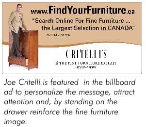
All you have to do is use yourself, your dog, sales manager, wife or kids in the ad to be the ‘carrier’ of the message. Add an interesting picture of this person (preferably yourself) in the top right hand corner of the ad. You can be playing guitar, have a hard hat on, riding a motorcycle, or jumping on a mattress.
Do something that is out of the ordinary, attention getting and fun. You don’t have to be a clown. You do have to be interesting.
Have a caption under your picture that delivers your benefit, guarantee, or a personal message to the reader.
Write the copy in a one-to-one conversational tone. Write like you are talking to a friend.
Sign off with a signature, and “P.S.” with an important message or reminder. Make it look like you actually care about the reader, not that you just want to make a sale at whatever the cost.
You’ll be amazed at how many people are more comfortable, and interested in buying from you when they start to know the man or woman behind the store. They’ll be more loyal, spend more, and trust you much more with their hard earned money.
Recap
1. Use FSI’s instead of ROP.
2. Use compelling, interesting, BENEFIT driven copy.
3. Spice up the whole thing with personality.
Brett Kitchen and Ethan Kap are cofounders of Traffic Guys Publishing, and are commonly known as the "Traffic Guys." Brett and Ethan run a retailer Marketing Mastermind Group to help retailers increase store traffic and sales, while cutting the fat and waste from current advertising. They also provide Done-For-You ads and promotions along with other systems to help retailers consistently drive in paying customers.
Questions can be sent to Brett and Ethan care of FURNITURE WORLD Magazine at bretk@furninfo.com.