Trends Display highlights ways to make furniture stand out while on a budget.
Retail Trends by Janet Holt-Johnstone
Key to increasing sales volume this season and (probably the next) is eradicating barriers between the consumer and the product. No more claustrophobic, tightly packed vignettes that limit both vision and imagination. Face it friends, it’s time to pull out all the stops!
Pierre D’Anjou and Andre Caron, known internationally as presentation design experts, are past masters of unique staging. Every year, based on months of research traveling worldwide markets, they’ve invariably produced work replete with their own approaches to form and function, beauty and practicality.
This year at The Canadian Home Furniture Market in Toronto they surpassed themselves. Said Pierre, “It is our ninth anniversary here, the tenth year of the Display, and I changed the concept. I wanted to make a BIG space like a big store within the confines of the display area at International Centre. To us, it had to be different, add something new to it, give it more impact to reach the visiting retailers. Then when they take their new ideas home to, in turn, reach their customers, get them motivated to buy.
“How can we fix the economic predicament? The cure? We have to create new things. We have to work harder. That certainly applied to the Trend Display, too, to work with a small budget, yet heighten the image of the show. I was proud to do it!”
The visual impression was modernistic, architecturally stunning, perhaps even a touch intergalactic. The floating motorized “flying saucer” signage banner with its “Quality” message, topped a space defined by a small army of impressive trapezoid shapes composed of 3’ x 4’ panels fashioned from textured building material, and partially covered with reflective aluminum foil.
The Display was mounted on an angled floor, this time six inches high. “It was one foot high at previous Markets, but since the intent was to welcome visitors to walk around as if they were in a village square, the area needed to be more accessible, friendly. Now there was no impediment to block you.”
The dramatic overhead aluminum beams carried fixed lighting, and “added structure to the design. We bought the lights for previous shows and found we could use them to good effect here again, both visually and economically.
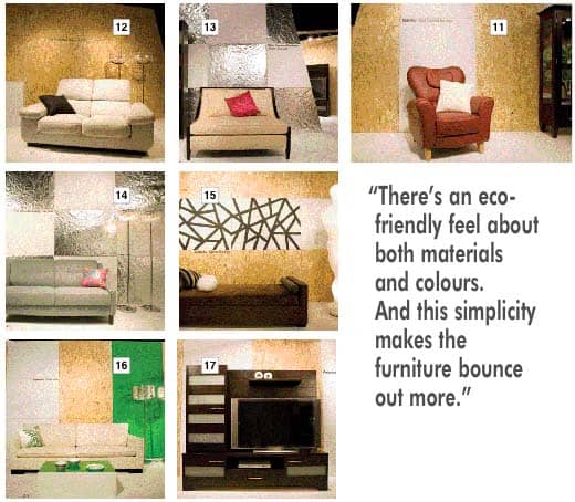
“We used white, natural wood tones and green throughout the Display, with fuchsia as the accent colour. There’s an eco-friendly feel about both materials and colours. And this simplicity makes the furniture bounce out more. Always we offer top-of-the-mind basic concepts and practical applications that retailers can easily use themselves.

“Andre and I went to Milan together and made many sketches. We focused on creating something elegant, beautiful... and inexpensive! Inspiration grows while you are working and ideas can come from anywhere. When you study the work of other people you think about your own concepts, then theirs, then consider how what you have seen might be adapted to your purpose.”
Simplicity, minimalism was evident as one moved from one area to the next. But there was nothing cold about the presentation. “For easy identification this year, an aid to the retailers, we applied manufacturers’ names on the spacer panels. This could also be done in areas within their stores to assist customers.”
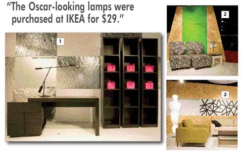
More geometry in the first space, foil rectangles checkerboard fashion, accenting Huppe’s [1] handsome and flexible dark wood desk. Perched on the desk as if resting from flight was designer Richard Zapper’s arresting lamp, and the adjacent tall bookcases were set alight by a half dozen fuchsia boxes arranged on central shelves. (Purchased at Hallmark Cards stores!)
Right next-door were two Dynasty [2] armless chairs, small but heavily cushioned in striking, black and white botanical print. They were placed against a broad panel in tropical seaweed green centred on one of the highly textured trapezoids. The accent table was also black and white and the perforated chrome shaded lamp picked up reflections from foil panels across the way.
The natural flow edged into a rectilinear panel construction, two rows of natural texture divided by a horizontal white painted panel the width of the area. The wall art is a futuristic pattern inspired by linens in a bedroom setting elsewhere in the Display, and was Pierre’s free-form art in non-reflective tape. “Eye-catching, matte, definitive to showcase the Romano sofa [3], chair and table. The Oscar-looking lamps are great fun, eh? Seven feet high, showstoppers! I bought them as display pieces from Ikea on sale, originally $59, but I got them for $29! They have been discontinued now. Wonderful for display. Retailers should look for items like this, inexpensive but arresting, pieces they can use again. I certainly intend to!”

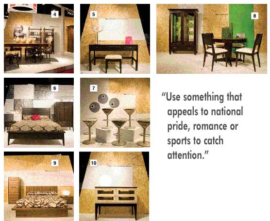
A heritage look from Meubles Canadel [4] paid homage to the four hundredth anniversary of the arrival in North America of Samuel de Champlain, “The Father of New France”. And Pierre designed an area of great warmth in commemoration. The collection, named “Champlain”, is fashioned as a reproduction of pieces used in old Quebec. The dining table and armoires are in solid wood, the shape of the armoires’ side panels narrower at the top in classic style. Chairs are upholstered in vinyl cowhide. Beside the large portrait of the man himself is a sketch of his ship. The space “Got a lot of very positive attention at the show.”
Pierre suggested that retailers recognize high days and holidays in their displays and marketing. “Something different to catch the attention, something that appeals to national pride or romance or sports events. Think and act outside the box!”
The width of one trapezoid was just enough to frame Valco’s contemporary vanity [5]. Against the woodsy texture, the sophisticated finish and clean lines are starkly beautiful. Note the touch of fuchsia again, to maintain accent continuity. The crystal-look lamp both casts and reflects light and is another eye-catching device.
A bedroom backed by angled white and aluminum rectangles has a distinct Scandinavian accent, in fact, the A.P. Industry collection is named “Copenhagen” [6]. The look of northern minimalism is enhanced by the soft brown grained finish and horizontal hardware, and offset by the Maison du Beau velvet floral bed covering.
“What an opportunity for fun!” exclaimed Pierre when he talked about Trica’s whimsical “Cosmo” stools [7]. “We couldn’t resist painting big cocktail olives on the white stair-shaped pattern on the backdrop. The floor is also white. Here, by the way, you can see clearly the 3’ x 4’ panels, they are not disguised, they have such a natural look and that’s good. There are five stools with five different fabrics . . . five different cocktails!”

The essence of spring again in a vertical panel behind MI-DI’s dining room [8], a sculptured round pedestal table with tapered-legged armoire and chairs. Decoration this time consists of vertical vases filled with “grasses cut flush at the top, and the glass plates in the armoire are printed with matching green graphics.
“If I were to choose a favourite collection it would be this. Mobican’s ‘Estacia’ platform bed [9], chest and night table; the wood is two shades, the styling beautifully simple, and the bedspread by Maison du Beau again is the design I replicated on the wall in other sections of the Display.”
A few steps away, Dinec’s “Diva” chest [10], “Actually designed as a television unit with room for audio technology and storage. It could be used anywhere, a very flexible piece, perhaps in the dining room as a sideboard, for any smaller space. Very simply displayed it floats against its own geometric sphere!”
A bright red chair, sitting alone, leather, “called ‘Jazz’, a departure for Dutailier [11], a new shape, younger, more modern. It speaks for itself and makes a statement of comfort. Find the right spot on your floor space for an interesting piece to stand out. Customers will gravitate to it; it can be a magnet. Make it so inviting and casual that tired customers will sit in it... then buy it.”
There is more to this wide-armed white leather Via loveseat [12] than the picture reveals. The impressive back is movable; more than a recliner, it’s a real comfort zone! Its placement against the textured, natural-looking backdrop with its one white 3’ x 4’ panel, makes the product jump out, impossible to ignore.
More foil panels define the stage setting for a loveseat in a different mood entirely, sleek, sophisticated, urbane, a Silva Custom offering [13] with wood trim and delicate curves. “The fuchsia cushion and the matching packages in the adjacent bookcases are energy lifters!”
There’s always room for retro when it’s subtly delivered. KSL’s blue gray sofa [14] could flex from bedroom to library to a loft’s open spaces with aplomb. The foil panels reflect, as do the crystal look-alike lamps, a cool look heightened by the show’s signature fuchsia.
Pierre’s abstract art again on white between natural panels draw the eye to a Lucy Au sofa [15], unexpectedly multi-use. A delicious deep chocolate brown, “Numa” is accented with blue, gray and the “Snowball” accent to balance the Oscar look-alike guardian! Throw off the cushions and turn it into a bed!
The winter white world outside International Centre didn’t deter the nearly 10,000 visitors. It was noted that most retailers were owners and buyers this year, and sales were optimistic. Spring’s definitely not far behind. If your showroom space has a dark corner or two, strong green tones, a botanical flavour, mixed with light woods will automatically revive thoughts of April flowers! Gen-Lite’s crystal floor lamps cast a sunshine glow on Italdivani’s beige silk sofa [16], “Canape Sottile”, green and white accent pillow, and green vinyl covered plexiglass table, (a quick buy from Crate and Barrel!) backed by vertical green, white and natural panels.
A big unit designed for big technology, a hit with masculine visitors, was a dark, solid wood entertainment centre sparked with horizontal silver-tone hardware, placed alone on a white floor and framed by vertical natural and white panels. Just what the consumer is looking for from Creations Vie Bois [17]. There’s room for every bit of gadgetry invented by man from a spanking new plasma television to DVDs to extra bags of popcorn!
The emphasis was certainly Canadian-made goods, but the European Community was present and accounted for. This year manufacturers switched their focus from product to the enhancement of customer quality of life, and stressed the importance of the female consumer, at last! Upholstery makers talked about texture, durability and green issues. Everyone placed emphasis on stunning slender silhouettes for smaller spaces. Plenty of reclaimed, recycled wood was in evidence and storage possibilities increase with every Market, together with double-duty pieces. And, wisely, customization was queen of the show.
Ads offered, “The freedom of lower risk, allowing your business to grow and breathe, too.” The suggestion, “Take 50 percent deposit from customers up-front, take delivery from (the manufacturer), receive the balance owing from the customer, and don’t pay the manufacturer’s invoice for 30 days.”
Said Pierre, “Yes, we have problems in the economy, but the good times are going to come back. Some companies are doing well right now with their new approaches to the customer, new ideas, new products. Manufacturers and retailers both are becoming more creative, listening to what the customer wants.
“Stores are now much more specialized. It was gratifying that when I was busy dismantling the display at the conclusion of the Market, buyers came to me and told me how helpful it was to them. That, of course, is the whole idea! My advice is always to stretch your imagination. Think about the way your customers live and put yourself in their shoes. Make them laugh if you can. Don’t be afraid to be whimsical, even outlandish! Work outside the box. That’s the whole point . . . have fun with your displays and your customers will too. And they will buy!”