Effective store design or redesign begins with a visual critique and a checklist for planning a retail environment that will boost your sales volume.

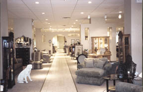
Finished installation showing wall extensions with shadow box and archway cut-outs. Aisles should always have definite destinations and allow vantage points for salespeople to observe customers.
As captain of your store — your mission, should you decide to accept it — is to get the most sales per square foot out of your space. As always, you have carte blanche as to method and personnel. My forty years of experience as an executive and space planner in the furniture and retail business, suggests that you use this conceptual blank sheet of paper to produce a plan that ties together a visual analysis, statistical information and CAD (computer aided design) visualization.
Such an expertly visualized plan re-directs the store’s mission to a team approach and helps organize space to create a powerful retail setting. Space planning is essentially a creative endeavor that involves visualizing ways to alter and re-arrange elements of your store’s design. These include your product selection, as well as architectural elements. It is a process guided by goals you set for increasing the efficiency and effectiveness of the buying and selling process, keeping in mind how your store appears to your customers.
This article is an overview of the three-part process explaining how to solve the problems of troublesome stores through space planning. This approach can be modified for operations that are looking to add additional stores as well as those that are just getting into the business.
Step one explains the essential visual walkthrough. Step two outlines the kind of information needed to make useful store planning decisions -- the statistical analysis of data concerning sales figures, square footage, non-sales functions, customer service and salesperson’s spaces. Step three is a detailed description of the design evolution and the part CAD plays in the conceptualizing of space.
Step One: The Walkthrough
A walkthrough beginning on the outside and proceeding to the inside produces a checklist.
Begin with a visual tour on the outside of the building. When you are trying to change the image of a store, you have to go about it from the outside looking in. I am always guided by first impressions. This first step is necessary. Put on your customer’s glasses and view the store through their "eyes." Make notes as you do your walkthrough. This information is used to discover problems and forms the basis of a checklist that can be referred to during the actual store planning process.
Create A Checklist
Brightness: Look at the store’s exterior brightness. Is it underlit making the store dark, unwelcoming, dangerous and forbidding or harshly lit creating an institutional feeling?
Display Windows: If your store has display windows, look closely. They tell an immediate story. Do the windows use vignettes to tell a story? Is the story told within conceptual price points? What do they say about the store? What is on display? Is there a selection of merchandise on display that is consistent with the price point of your store? What assortment of merchandise can you see from the outside?
Color association: How do fabrics on upholstery and accessory items blend with each other?
Active demonstration: Is the window space used for moving exhibits? Lord & Taylor’s famous Christmas windows with animated scenes brings in shoppers from all over the world.
Lighting: Is the window lit in a pleasing manner to show the sofas, love seats, wall units, dining rooms, and lamps to best advantage?
Exterior Signs: Exterior signs visually communicate in a powerful way. Signs can use corporate colors and logos and transmit a feel for what the store is about through typography and design. Does your store have distinctive signage? Do the signs convey a certain image of quality or contemporary styling or budget pricing? Is the sign proportioned to the outside fascia subject to zoning restrictions? Does the building need more signs? Again, building codes figure in here. Does signage in the entrance on the main road identify your store properly? If your store is in a strip mall does the position of your sign on the main directory showcase your store in the best possible way?
Entrance Doors: Do the entrance doors tell the customer your hours, which credit cards you carry and if there are any special sales in progress?
Entry: The next step is to enter the store. Is there a vestibule? Vestibules have several advantages. They provide a barrier to the weather. They are also useful for preventing theft because it is more difficult for a thief to go through a double set of doors with an ill-obtained object. The negatives for vestibules include subtracting space from the total store and diminishing the dramatic impact of your spectacular and carefully designed entrance.
Interior Lighting: While you walk through the store, note its brightness. This is a very important factor in showroom display. Many furniture stores have old ceilings traditionally painted black. this effectively lowers the ceilings, distorts colors and imparts a gloomy atmosphere to the displays.
Focal Points: Does the store look crowded or cluttered? Is there a first focal point? Is there a second, third or fourth focal point? Is the store organized by department? Does the store have or need gallery set-ups? How and where do the aisles direct the customer? What merchandise is on display? Is there warehouse clearance area? Where are areas for salespeople to rest, observe customers and do paperwork?
Aisles: Aisles should always lead to certain destinations. Where are aisles leading customers? From a selling point of view, they should guide a customer to see all the merchandise. Aisles can serve as vantage points for salespeople to observe the customers, allowing them to interpret body language and respond to other cues. Are the aisles at least four feet wide? Fire marshals require this amount of space for safety. The four-foot width is also needed to provide adequate space for moving furniture when modifications of the interior floor plan becomes advantageous. What are the aisles covered with? Does the floor covering help to direct store traffic? Aisles usually start 24’ to 30’ from the exterior wall around the perimeter of the building to accommodate sofas, wall units and other large pieces.
Displays: Do displays look attractive and well maintained? Vignettes need extra space of at least 3’, not counting the aisles.
Non Selling Areas: Pay attention to the non-selling areas. Where are the lavatories? Where is the office space? Where is the customer service area, the receiving area? Are these designed for easy access and optimal efficiency?
 |
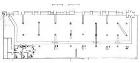
Drawing made On initial walkthrough of older building in NYC shows position of numerous columns and suggested wall placement to guide traffic flow and showcase products at Seaman’s location. |
Step Two: Research
After the visual inspection and compiling notes from observations about the exterior and interior of the store, I ask questions designed to provide information for a compilation of the numbers. Intelligent space planning begins with an analysis of the numbers. Ask yourself these questions:
•Do you have a budget or estimate of what this project will cost?
•What are the projected sales for this store?
•Are you happy with your store’s current image or is it time for a change?
•Are you satisfied with your sales per square foot per store?
•Do you know the sales per square foot per store?
•Do you have an idea of the type of presentation you would like to create? What size do you want the store to be?
•Is there a chain of stores or an individual store that you might want to use as a model?
•Are you looking to upgrade your merchandise?
•Are you interested in upgrading your merchandise turns?
•Where do you want to be with your operation in the next five years?
•Are you happy with your merchandise mix?
STEP Three The Design Treatment
When it comes to the design and drawing phase, experience and creative talent, as well as a deep knowledge of CAD are necessary to produce the best quality and most useful drawings. CAD’s ability to manipulate architectural elements permits the serious space planner to present concepts, add walls, lay out the traffic pathways of aisles, add vignettes and show vantage points from which the sales team can observe customers.
I reserve space in the back of the store for bathrooms, customer service, receiving areas and build out from there. The June/July issue of FURNITURE WORLD will discuss how to plan these spaces, their dimensions, considerations based on sales figures and governmental requirements for handicapped access.
A CAD program was an indispensible tool in the renovation of a 16,000 square foot, 150 year old space on 14th Street in New York City. The rectangular space had obstacles — thirty load-bearing columns, each two and a half feet in diameter lined up uniformly — almost militarily.
To create interesting spaces to show furniture, the regimental columns were used to anchor walls. These were camouflaged by creating angles. Closely spaced tall windows were problematical. This window problem was solved by building out the walls in between the windows thereby creating extra wall space for room vignettes. This also preserved the open feeling of being able to look into and out of the store.
These elements and room for aisles, bathrooms, customer service, a receiving area and manager’s office had to comply with New York City’s strict building codes. Subtracting these considerations from then 16,000 square feet ramped up the need for an expert space planner and the use of CAD technology.
 |
Vestibules provide a weather barrier and are useful for preventing theft. Negatives include subtracting space from the display area and diminishing the dramatic impact of the entrance. The vestibule shown at left was designed primarily as a security feature in a busy city location. |
The Planning Decision
If you are planning to design or redesign your store(s), you first need to consider if you have enough available time to give to the project. Can you supply the basic planning elements, desired vision and future direction? Can you conduct the necessary research to determine what will be displayed and in what quantity? Do you have the in-store expertise to use the available CAD technologies instead of being hampered by them? If you don’t, then you should consider getting outside help.
Whether you design in-house or not, this series of articles will help you to make the process proceed efficiently and move toward the best possible result.
Bill Blake is President of WRB Associates a space planning and design firm that creates and maintains retail environments that increase sales per sq. ft. and boosts merchandise turns. Questions can be sent to Bill care of FURNITURE WORLD at wrblake@furninfo.com.