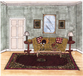
The principles of balance, scale, proportion, unity, rhythm & emphasis/focal point.

Editor's note: Many thanks to Sheryl Howard creator of the E-Z decorator system for preparing examples of the design principles outlined in the print version of this article and the drawing illustrating radial balance above.
In the August/September issue of FURNITURE WORLD we introduced you to the Elements of Design. The six elements were: space, line, form, color, texture and pattern. This month The Principles of Design will be covered. These Principles are the tools with which the Elements are applied. There are five basic Principles of Design. They are balance, scale, proportion, unity, rhythm and harmony, and emphasis/focal point.
BALANCE
Balance is defined as visual equilibrium in design. It is visual weight that will make an object appear heavier or lighter than others and effect the balance of the room. Large objects, bright colors and rough textures have heavy visual weights. Small objects, cool colors and smooth surfaces are visually lighter.
There are three types of balance:
- Symmetrical Balance creates a mirror image from one side of an axis to another. It is formal and rigid. It can add stateliness or dignity to a room.
- Asymmetrical Balance creates a feeling of equilibrium by using different objects of the same visual weight on both sides of the axis. It is created through variation in shape, color and pattern. Asymmetrical balance tends to be more interpretive and less formal.
- Radial Balance is created by working outward in a circle from a central point. Radial balance tends to be pleasing to the eye and usually adds interest to an interior design.
SCALE
Scale is the size of an object when compared with the size of the space it is in. For example, a grand piano placed in an alcove would be out of scale with its surroundings. The same piano would be in scale in a large room with high majestic ceilings.
PROPORTION
Proportion is the relation of the size of one part of the object to the size of the remaining parts of the object. Furnishings, while being in scale with the room, must also be in proportion to one another. For example, a small table with a large lamp on it would not be in proper, proportion.
UNITY, RHYTHM AND HARMONY
Rhythm is created through the repetition of color, line, form and texture; carefully positioned in the room. These elements, move the eye around a room either comfortably or in a jumpy manner. Like the various rhythms associated with music, visual rhythm moves the eye at a variety of tempos.
A slow relaxed rhythm can be created with connection of color and lines. Colors can gradually intensify or become lighter or darker gradually. They can also create a rhythm through repetition. A faster allegro rhythm can be created by the vivid contrast of light and dark, by lines which abruptly change direction or which are broken and scattered around a room.
Harmony is achieved, again, in much the same way as is musical harmony. Concordant notes create a subtle sense of belonging together. They create a comfortable feeling in much the same manner as does unity in design. Discordant notes create a tension, a slight sense of unease or being off-balance just as the use of variety does in a decorating scheme. Too much unity can be very boring; too much variety can create anxiety. Finding the proper balance of each with the other is the key to good design. You might try using a variety of treatments in a unified color scheme.
EMPHASIS/FOCAL POINT
The focal point is the center of activity; special attention or prominence given to a particular furniture, accessory or architectural element. Focal points "hold" a room together visually by drawing the eye to it.
Now that you know what the five basic Principles of Design are, how can you better understand them and how can you make them work for you? Go through your decorating magazines and find several pictures dealing with each of the Principles described above. That is, find pictures dealing with:
- Balance: Look for pictures which give examples of symmetrical balance, asymmetrical balance and radial balance.
- Scale: Find pictures of a grand piano or some equally massive piece of furniture. What size room is it in?
- Proportion: Look for pictures of a chair, table and lamp setting. Are they sized proportionally?
- Unity, Harmony & Rhythm: Look for a picture of a room that uses all of these in a pleasing manner.
- Focal Point: Look for pictures of rooms with definite focal points. For example, rooms with a fireplace, a picture wall, etc.
Marlene Pearce, a principal of Marlene Pearce And Associates. Marlene presents the "Interior Decorating Seminar" and "Certified Drapery Consultant Program," using her workbook "The Interior Decorating Workbook" to retail consultants across the US and Canada. Questions on any of these subjects can be directed to Marlene Pearce care of FURNITURE WORLD Magazine at editor@furninfo.com.
Illustrations in this article composed on Cheryl Howard's E-Z decorator system. Excerpts in this article taken from: "The Interior Decorating Workbook" by Marlene Pearce and the "New Guide to Soft window Treatments" by National Decorating.