As of the writing of this article, economic gurus tell us the economy’s trending upwards with slow growth and positive consumer confidence, not withstanding election year concerns.
This past summer we’ve experienced the best housing market in a decade, actually topping a more than six per cent rise over last year. There’s an unstoppable surging movement amongst Baby Boomers, GenXers and Millennials. And, there are massive lifestyle changes implicit in changing demographics over the next couple of decades, greater eclecticism, and a strong desire among the furnishings-buying public to individualize environments. Unemployment continues to decline. A much larger segment of the population will be working from their homes, generating many new home-centered services. Furniture industry leaders predict robust consumer demand for the unique, the different, the exciting.
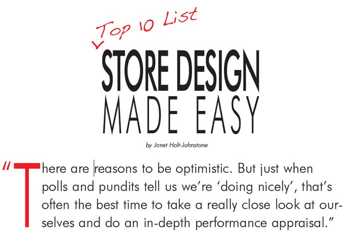
There are reasons to be optimistic. But just when polls and pundits tell us we’re ‘‘doing nicely” thank you, that’s often the best time to take a really close look at ourselves and do an in-depth performance appraisal. It can be our wake-up call for the new era beckoning! Questions, if everything’s so great, why, for some retailers, is showroom traffic just creeping along and when customers do come in they’re gone again in less than 15 minutes? Why aren’t websites drawing more activity and action, and why don’t those enticing inventories spark customer interest?
It’s in “exciting times” like these that we should get out our thinking caps. And who better to respond, interpret and guide than Miss Connie Post Benton, gifted with not only a sound knowledge base but an inborn, cannily insightful sense of what’s around the corner? “By the pricking of my thumbs, something lively this way comes”!1 She’s well qualified to direct a bit of soul searching, help interpret and define basic nitty-gritty problems where they exist, and clear the way to morph over and around obstacles. As CEO of Affordable Design Solutions, she’s responsible for initiating the glamorous, sales-oriented “look” of more than 20 million square feet of retail and wholesale space.
Top 10 List
Challenged to define today’s “10 biggest problems in retail stores, especially those with a bit of vintage”, and “the ideal solutions if they’re on a budget”, or are “ready for a big renovation”, Miss Connie offers the following issues home furnishings retailers face. Here, are the top 10 common problems, close to home for too many furniture retailers:
1. “Under capitalization in preparation for changing times, is a huge problem. Waiting too long to change so that it becomes very expensive and hard to swallow.
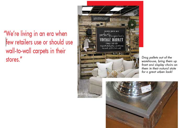
2. “The use of dirty worn old carpets remaining in position all over the entire store! (Yes, people really do let this happen!) Remember that we’re living in an era when few retailers use or should use wall-to-wall carpets in their stores. Every design magazine shows beautiful hard surfaces in photos with the focus on really attractive and profit-generating area rugs. Check out HGTV and you’ll see what buyers are looking for. NOT carpet! (However, area rugs, the WOW factor, yes!)
3. “A huge problem for some retailers, they didn’t move their stores with city growth! Be on the alert!
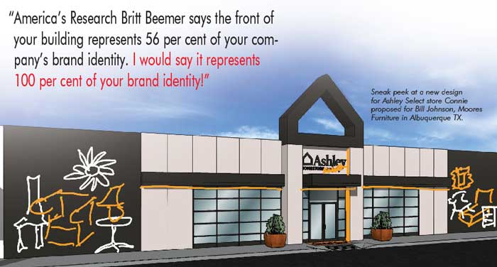
4. “And there are retailers who have not addressed the front of their buildings. America’s Research Britt Beemer says the front of your building represents 56 per cent of your company’s brand identity. I would say it represents 100 per cent of your brand identity!
5. “Another problem could be your own front door! And the first 1000 square feet of your store. The customers’ first and last impression of your store. What does your front door say to your customer?
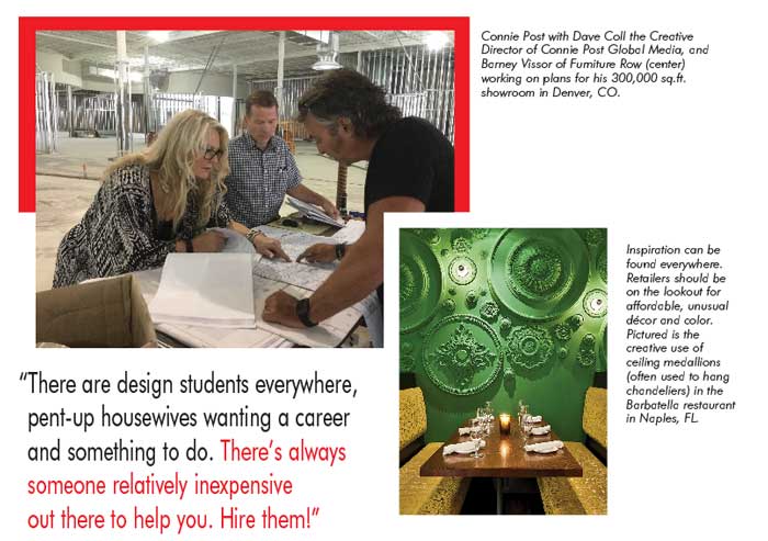
6. “Not having a visual merchandiser on your floor, even part time. This can be a huge, often-overlooked problem. Stores look untidy very quickly if you are doing any business – pictures off the walls, no lamps on tables, the décor just doesn’t match the latest sofa dropped into an empty spot on the floor! Be aware that there are design students everywhere, pent-up housewives wanting a career and something to do. There’s always someone relatively inexpensive out there to help you. Hire them!
7. “Not changing out samples. Allowing drawers, handles, pillows to be missing or damaged on the floor. Yikes! This single thing irks me so much! There is no excuse for your furniture not being spotless, without blemish or having a missing part. NO EXCUSES.
8. “Out-dated logos! Holding on to tired tradition in a modern world. When the barn needs painting, I say paint it! Now! There is way too much competition to appear dated and sad in a MODERN world.
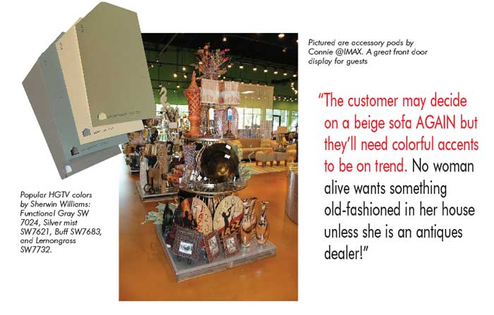
9. “Not adding fashion and colorful upholstery on at least four to six collections on your floor! If one more person tells me ‘It doesn’t sell!’ you may have to bail me out of jail! Fashion statements set the tone for the rest of the shopping experience, reinforce that you’re trendy and have new ideas and new product. The customer may decide on a beige sofa AGAIN but they’ll need colorful accents to be on trend. No woman alive wants something old-fashioned in her house unless she is an antiques dealer!
10. “Absolutely the biggest issue in our industry is complacency. Some retailers go to conferences, but only a few attend those great seminars offered at Market for new ideas, new thinking, nor do they spend research time on the web, browsing shelter magazines, seeing what their customers are seeing, shopping new lines, looking for the NEW. Because NEW always WINS!”
10 Design Solutions
Here are 10 big and small easy retail solutions:
- “Rope! Yes, really! Rope is your friend and can be used for more than tying up stuff! For example, a rope wall!
- “The fabulous flexibility of movable walls for modern, stunning change. Inexpensive, quick, highly effective.
- “You cannot go wrong with HGTV color paints by Sherwin Williams. The show is a hit and the colors are trusted. Look for Functional Gray, Silver Mist, Buff and Lemongrass. Enlighten your customers! Co-brand and add chips to the wall so people can paint their walls at home!
- “Create those dynamite lifestyle vignettes – living room, dining room, bedroom – and decorate them heavily with your best foot forward! Place them close to the front of your store for a great designer look. Yes, departmentalization is good for ease of shopping, but you need to ‘spotlight’ in these special areas to give your customer something to talk about, something to take her breath away!
- “Go vertical with products to mix it up a bit... or a lot! Seriously, stack accent chests, put a bench or chairs on top of tables, and accessorize like Pottery Barn does it and more!
- “Change your fluorescent lighting to color-corrective bulbs. You will see an immediate dramatic difference and so will your customers! Honestly!
- “Paint the outside of your building and give it, and yourself, a whole new look! Spark their imagination!
- “Pallets are in everyone’s warehouses today. Drag those things up front and display chairs on them in their natural state for a great urban look! Even better, paint them stark white for a fresh new look in the spring!
- “And old shutters! Shop for them at your re-sale store. Yes, you read right! Habitat for Humanity has them all the time. Nail them to the wall, or create movable walls. Then paint them in a rainbow of hot fashion colors!
- “The biggest issue with retailers today is getting people in the door. Reinvention is the only sure way to get people to notice their businesses, starting with the outside in, changing up merchandising strategies, differentiating themselves in big ways from others, entertaining them once they get there. And structuring an aggressive marketing campaign!”
Miss Connie adds, “Many retailers today do not tap into the emotional places of the heart with their marketing. Tell customers ‘beautiful will change my life’, that they will love ‘coming home’ to their gorgeous new living room, that their kids and husband will appreciate them more. Now that taps into the soul of the female consumer. My personal dream is to be their voice, to be a conduit of change for the industry, create retail with surprises... and in the most affordable way!”
Over the decades, an assortment of enterprising retailers, each outstanding in their own way, have turned their challenges to opportunities.
That’s Entertainment
Jordan’s Home Furnishings: “My all time favorite project! Jordan’s Home Furnishings, New England. Barry and Eliot Tatelman! Their principal need? A whole new impossible-to-ignore direction, a truly unique approach to marketing and presentation. Their MOM, Motion Odyssey Movie addition, and their many Monster promotions and tightly targeted fantasy, were the answers. Their Grand Opening created the largest traffic jam ever recorded on Route 24! The lessons? Pull out all the stops! Take a deep breath and go for it! Dare to be different!”
Family Values
Brown Squirrel: Preston Mathews says that Miss Connie “partnered” with him to produce the extreme changes that “honored his father’s memory”.
“An amazing man,” said Miss Connie. “Preston aspires to be very different from others in his market. He wanted to identify and create links with the history and legends of his fascinating community. Including building a replica of a mini-log cabin within Brown Squirrel together with a contrasting city urban loft! We’re continuing to develop his dream with the second phase of his aggressive multi stage reinvention.”
 The Boulevard:
 “The question posed by the Wittwers’ was, how to retain pioneer Mormon values, heritage and wonderful family life, and combine that with recognition of today’s culture? The Boulevard is in a railroad region so, of course, we designed a large in-store train engine emerging from its tunnel with a bell for kids to ring, and a station ticket booth masquerading as their service counter! And Cedar City’s annual Shakespearean Festival is celebrated with a large theater entrance flanked by costumed mannequins in their recliner/motion area.”
Design To The Next Level
HOM and Gabbert’s: “Rod Johansen at HOM and Gabbert’s basically said, that he needed to go to the ‘next level’ in the design of the new prototype HOM store, stepping it up even more for the new Gabbert’s high end store in Little Canada, Michigan. Strong architectural designs define each area, 35 foot ceilings, 20 foot fireplace, three large circular red rotundas down the middle. The décor focus duplicated rooms of Architectural Digest stars, Georgio Armani, Patrick Demsey, Ralph Lauren.”
A Millennial Magnet
Cardi’s Furniture and Mattresses: “Brothers Nick, Ron and Peter Cardi’s need was to create the new prototype design for future Cardi’s stores. The ‘problem’, devising an emphatic invitation for Millennials, a store ‘that screams Millennials’! With huge, oversized, very colorful graphics, a man surfing on blue water, beach scenes, indoor visualizations – a sense of life and energy. And a true-to-size beach house under a sky blue ceiling at the entrance to reflect the cape area. Plus an industrial warehouse-looking apartment for urban furniture and décor. Millennial magnets!”
Moving On Up
FurnitureLand Delaware: “A great project, the challenge for Larry Barnes was to grow the business, particularly mattresses. We moved the department up front and center, trading with the dining department. Mattress sales grew from 11 per cent to 22 per cent immediately. Then a carefully planned over all update of the entry area changing to lifestyle vignettes and upholstery reinvented to feel more coastal, added up to huge increases in overall business. Larry is now renovating the exterior which will represent and influence (as we know!) 56 per cent of his marketing brand identity for the future!”
Adding On
Coconis Furniture: “The unique mind-twister for Randy Coconis and family was the building, a wonderful old fashioned pole building on the inside. But very expensive to insulate and HVAC. Problem! The solution, we added to both ends of the existing building making it very long and linear, and Randy agreed to add an area for outdoor furniture in the front, upgraded the door entry of glass, with a champagne metal roof. The customer can see from end to end on entering the store, faux wood aisles, beams, large open fireplace, and huge lifestyle photos of people enjoying lounging behind the recliner department beckon the customer to investigate and escape! It was a study on how to get the most from a building.”
Store Facelift
Lacks Valley Furniture: “Over the years, Lee Aaronson’s flagship Gallery store had lost its luster. A revival problem! The solution, to begin with an exterior facelift, then continue inside for a complete store redo! Thus two extreme concepts have been presented to change the outside and there was unanimous decision in favor of the one I love most! A work in progress, each opportunity for update and change for the modern world will be confronted and solved by the Lacks’ Team of owners, buyers, the visual folk and management on presentation.”
Retail Rescue
Slone Brothers: “A first visit to Louis and Michael Slone’s central Florida store revealed old duct work, hanging insulation and a store crying out for rescue! The need was for complete rejuvenation. The changes proposed were dramatic, faux walls were added, and a copper-look roof tower for added visibility from the road, a sexy new wood door, slate floor entry and canvas awning. Inside, modern fireplaces, faux vinyl wood flooring throughout, poetry on the walls! and brick veneer for a cool urban area. Also a Stickley Gallery that boosted sales. A very large problem, with sweeping answers. Recently, after seven years, the brothers are planning an update to the exterior colors of their building for a fresh look. They want to be perceived as new again!”
Conclusion
Performance appraisals, formal or informal, require passion, focus, imagination and more than a soupçon of honest thought, documentation and evaluation. They need our own checklists to re-engineer, flex and deal with inevitable economic climate change.
Footnote: 1 Macbeth, act 4, scene 1 (page 22, right hand column).
Janet Holt-Johnstone is retail editor at Furniture World Magazine.